
Subscribe to continue reading
Subscribe to get access to the rest of this post and other subscriber-only content.
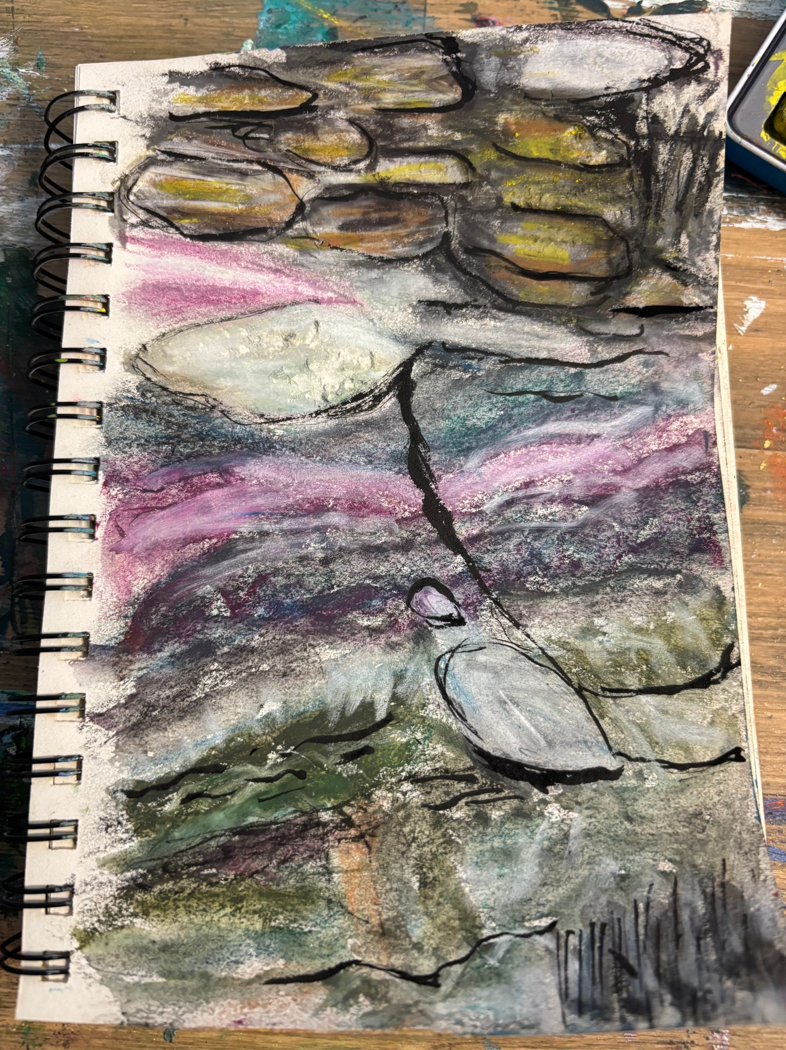
The art processes used and the thoughts behind CLT_Abstracts collection of paintings
Subscribe to get access to the rest of this post and other subscriber-only content.
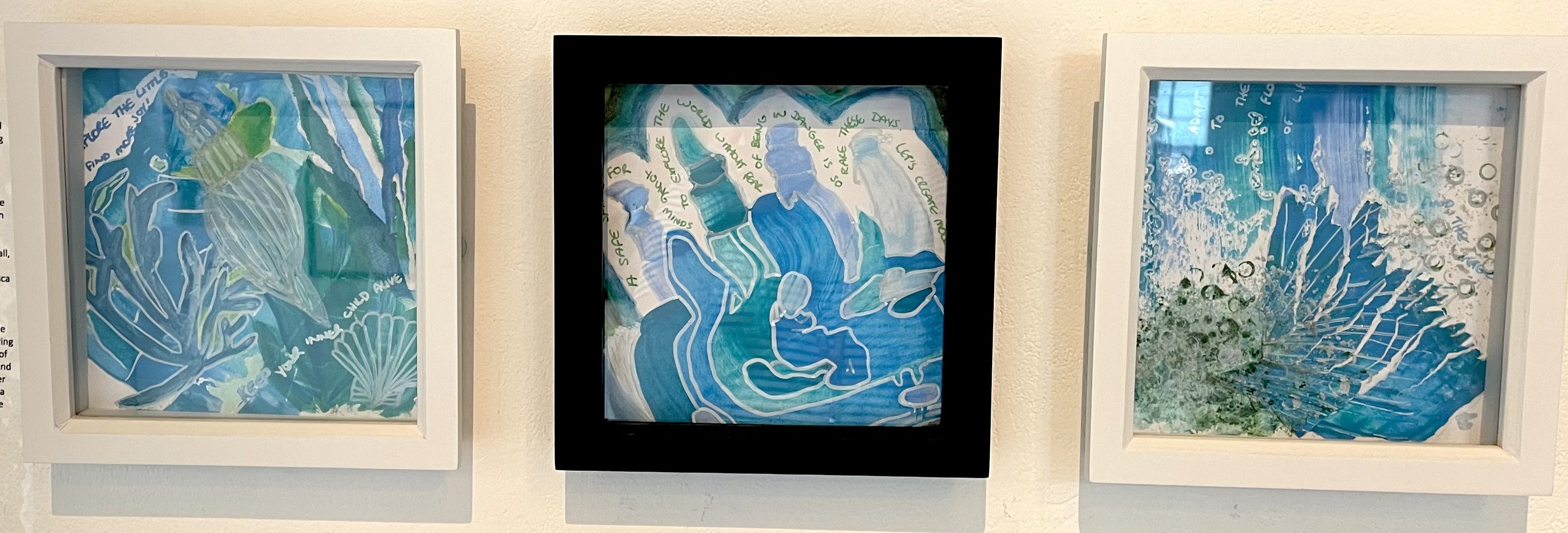
This set of 3 mixed media artworks have been in a recent exhibition at the Poly in Falmouth. They started as experimental pieces whereby i tested out different processes and went with the flow. I decided to make them with the mindset that nothing was a failure or wrong, even if it didn’t end up exactly how i expected. I let the work guide me through each step and found this a very liberating way to create. I would usually have this intuitive approach but with a bit of intention in it. The only intention i had for these 3 pieces was to use coastal blues and white. Here is a breakdown of what i did for each one and what meaning they took on at the end:
Part 1 – represents finding joy in the little things like exploring the coastline and discovering seaweed mixed with spiral shaped shells. I was thinking about the fun things i had done when i was younger and one of them was looking in rockpools. I loved discovering little creatures and pretty shells. If they were really colourful or patterned, even better! I made this one from collaged pieces, to create a texture that reminded me of the shells, and towards the end i added the intentional spiral shell shapes. It brings me a feeling of nostalgia when i look at it.
Part 2 – is of a mother sitting on a rock clutching her baby and overseeing her other children chatting together amongst the rockpools. A moment in time, in a rare place of safety, and even that can change with the tide. This one started with me dragging the paint around with no thought. A completely intuitive and experimental process filled with curiosity at what it would turn into. I then outlined the painted marks and that is when i saw figures appearing and a story. I don’t have children of my own and i have been subconsciously grieving that lost chapter of my life. So it was interesting to paint from a mother’s perspective and sit with that “mother wound”. It showed me my fears of hypothetically trying to manage to keep all the plates in the air and keep the children safe, and i can only imagine how stressful that would feel. So hats off to all the Mum’s (and Dad’s) out there doing it! You don’t get a manual and yet you’re all finding a way to do it. I think my fears probably come from being a perfectionist and obviously being a parent would be an organic process, so you can’t control every aspect of it and get it all perfect all the time. Anyone even attempting to get pregnant, and then do all the other things after that, is pure magic in my eyes. I’m not sure it’s on my horizon. All i can do is pray and hope the universe has a plan to make it happen or maybe something else will take it’s place.
Part 3 – is of sea spray and water bubbles, signifying the flow of life. I think this is my favourite of the three to look at because it feels balanced and has more lighter areas in it. It is made up of collage, posca details and textured painted areas. The bubbles created an interesting pattern and add to the light and airy feeling of the piece.
All 3 were on show at The Poly, in Falmouth, recently and they were presented on the wall as you can see here in the photo below:
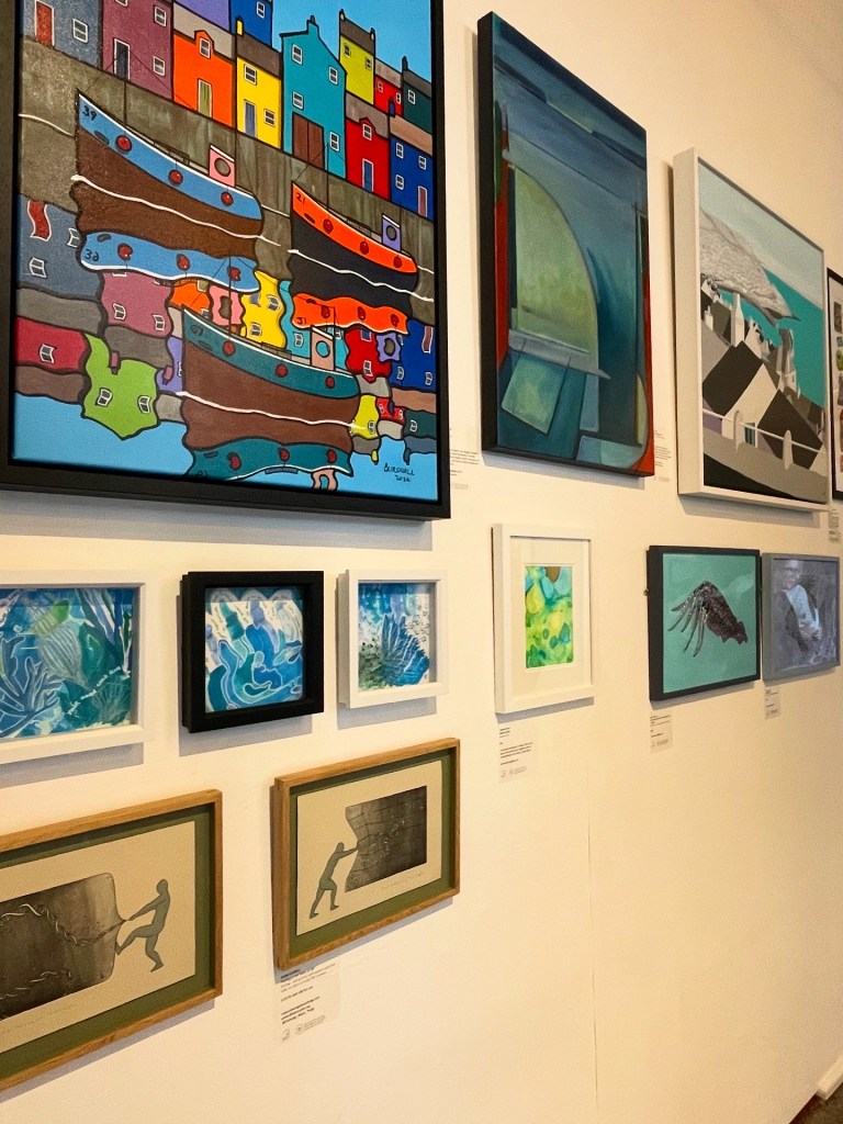
I think that the curation of the Member’s show was done very thoughtfully because the colours and textures were complimentary between all the works on each wall space. The subject matters were mostly coastal themed too which was nice. You may notice there was a continuity with the outlines and colours, the patterns, the size of the works and the frame choices.
If you would like to buy the set, or even just one part of the 3, please go to my website: https://www.cltabstracts.co.uk/original-collection/framed-coastal-mini-series
Thank you for supporting my work! Feel free to send me a message on Facebook or Instagram to chat. My inbox is always open to answer your questions about my art process or the artworks themselves.
Much love, Charlotte a.k.a CLT_Abstracts

Mixed media on reclaimed canvas, 23.5″ x 23.5″ x 1″ / 60cm x 60cm x 2.5cm
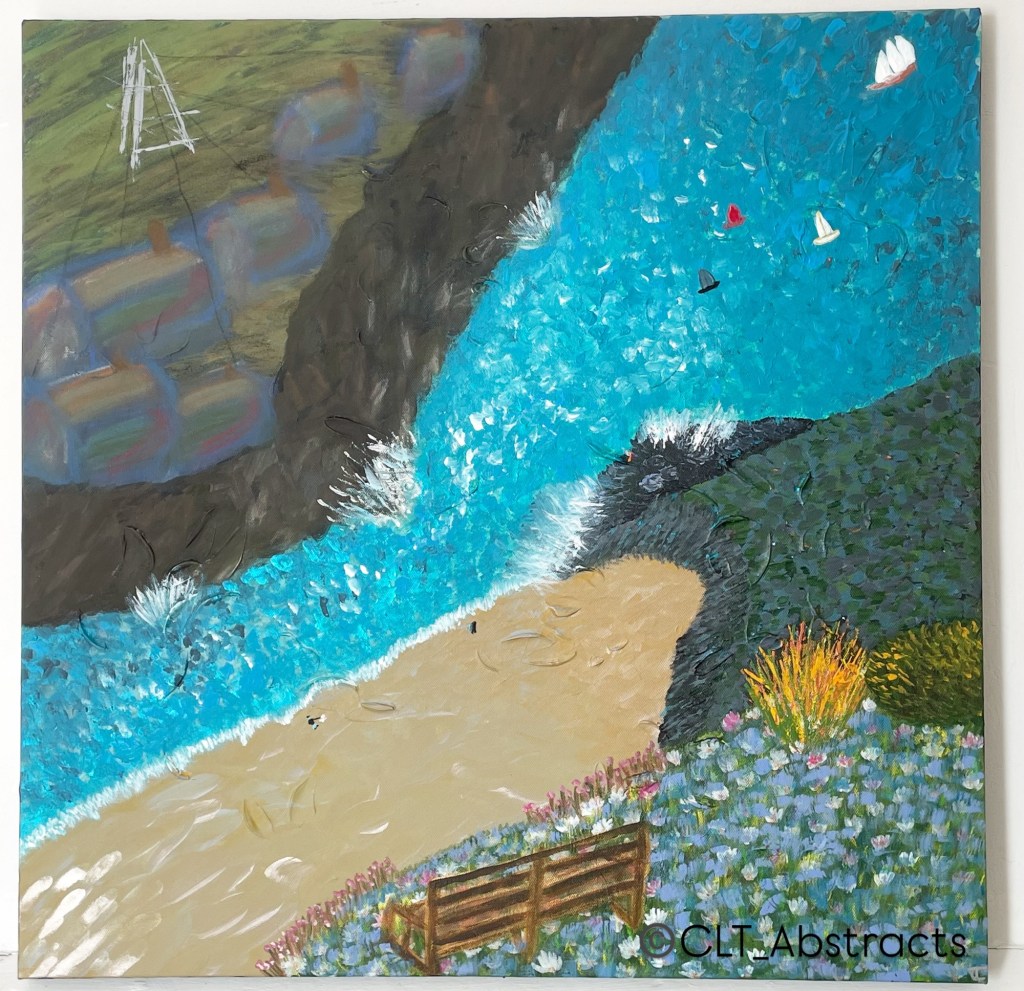
Here are few things to discover in my latest painting:
2. The electric wires seemingly conjoining the houses, forming an aspect of community but also appearing to hold the buildings back from the edge of the cliff. There is a lot to be said for having a sense of belonging and having people looking out for you, as a form of protection and support.
3. The empty seat, with a gap in the flowers in front, suggests it’s a suicide spot where people jump from, but also a place of solace for those left behind. The fact there is no one sat on the bench, alludes to there being no one left behind because one suicide led to another. It also could be a nod to loneliness, adding to mental health issues. This particular part of the painting was loosely based on Hell’s Mouth in Cornwall, in support of all those left behind or battling their own thoughts to stay.
4. The heavenly meadow of calming, coloured flowers blowing in the breeze, as if it’s a place to go that is soothing and a place of remembrance. But at the same time, as with everything in life, there is a flip side of representing the afterlife and a heaven like place where souls gather in togetherness but sadness.
5. The bright orange bush at a quick glance looks like flames of a wildfire, giving the sense of danger. This is echoed with the sheer drop of the cliff face.
6. I wanted to use distorted size values of the buildings and cliffs to convey a feeling of overwhelm and confusion. If you’ve ever suffered from a mental health issue that changes your perception at times, you’ll know that it can be hard see what is true and what is the mind playing tricks. For some people, the tricks can go on for so long that it can be hard to recalibrate. This is when you need to call in the Calvary of support whether that’s having friends and family by your side, telling your boss (if you have one) that you can’t work at the moment or trying a new med or therapy or something else. Don’t be afraid to reach out and tell someone how your feeling. It will help to stop it escalating into a bigger problem to tackle. It’s not your fault. Your brain just needs support to function. Let’s not even get into the fact that the world is geared towards supporting typical, fully functioning people to do well in life, leaving the rest of us to cling on and muddle through feeling totally lost and unwelcome and broken. Urgh.. i digress…
7. Another aspect I wanted to mention is the juxtaposition of the soft aesthetic of the blended pastel houses on one cliff with the dabs of acrylic on the other cliff opposite that has a more structural and textured appearance. This is to convey the duality of life. The spectrum of feelings we have. The feeling of being on a rollercoaster with the highs and lows of life. The way our brains can go all or nothing or flip from happy to sad. The darkness and the light. The introspective days and the social butterfly nights. Whatever that duality looks like for each of us is unique and none of it is wrong. It’s just our human experience. It’s just one part of who we are amongst a ton of other beautifully chaotic things. Just because we have those darker times, it doesn’t mean we dont have light in us too.
Just like the light shining on the sand in this painting, I hope you will celebrate all the imprints you make on people’s hearts as you travel through life. Your legacy is how you changed someone’s feelings just by being you! You have been doing this since day dot, without realising or trying and with all your struggles you carry in your rucksack. Don’t forget how beautiful that is ❤️
Love always,
Charlotte, from CLT_Abstracts
xXx

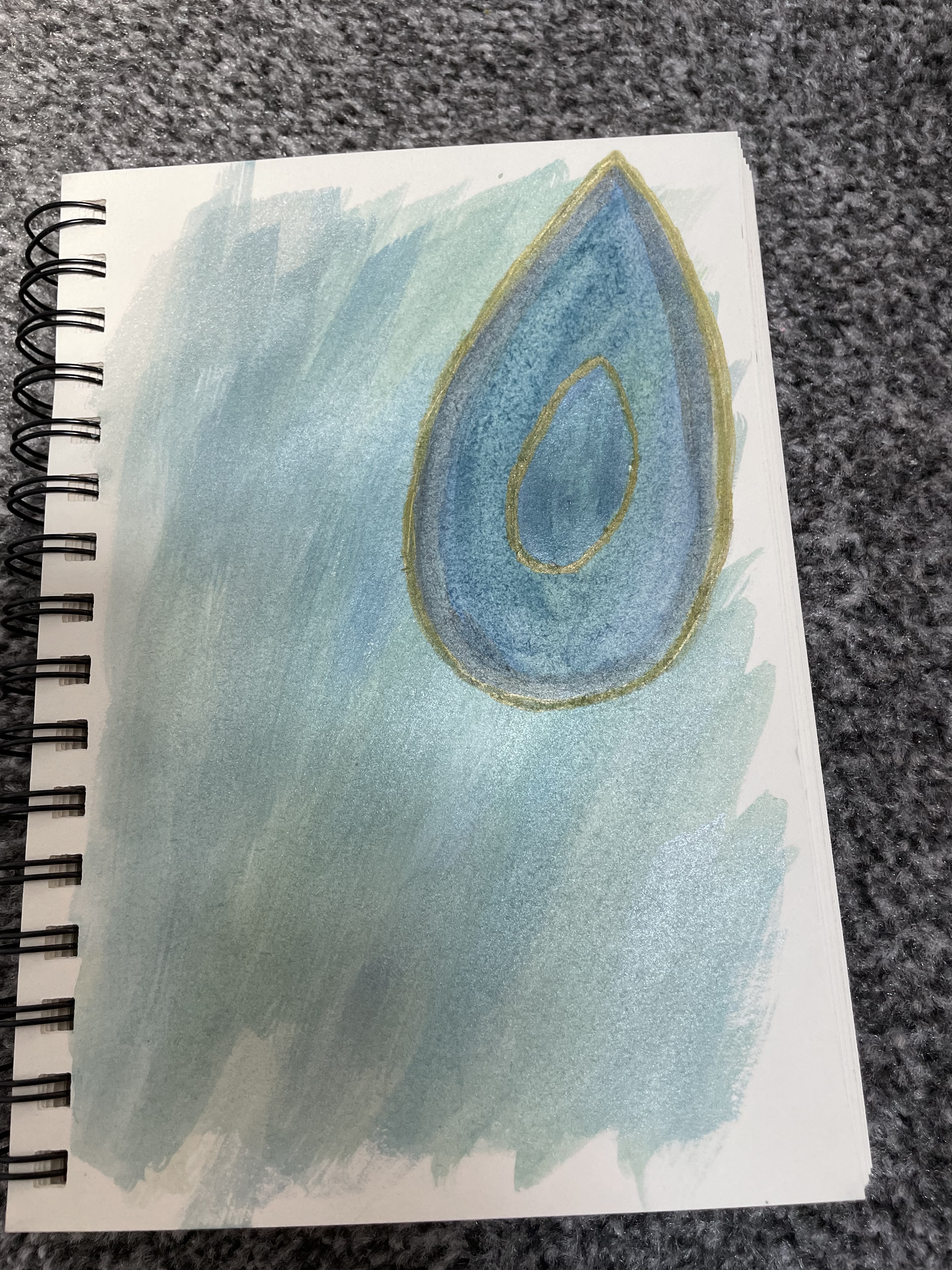
I used to rely on random inspiration with no set theme or template to work from. I found the extensive freedom with this too overwhelming, especially as someone with adhd. So this year, i decided i would create a monthly theme to focus my work on. This is as follows:
| Month | Theme |
|---|---|
| January | Marks – stencils/marbles/sticks |
| February | Light blue abstract studies |
| March | Inktense views on postcards |
| April | Flowers in bloom |
| May | Changing sea colours |
| June | Trees |
| July | Abstract people |
| August | Energy bursts |
| September | Orange studies |
| October | Texture studies |
| November | Christmas cards |
| December | Still life amongst the chaos |
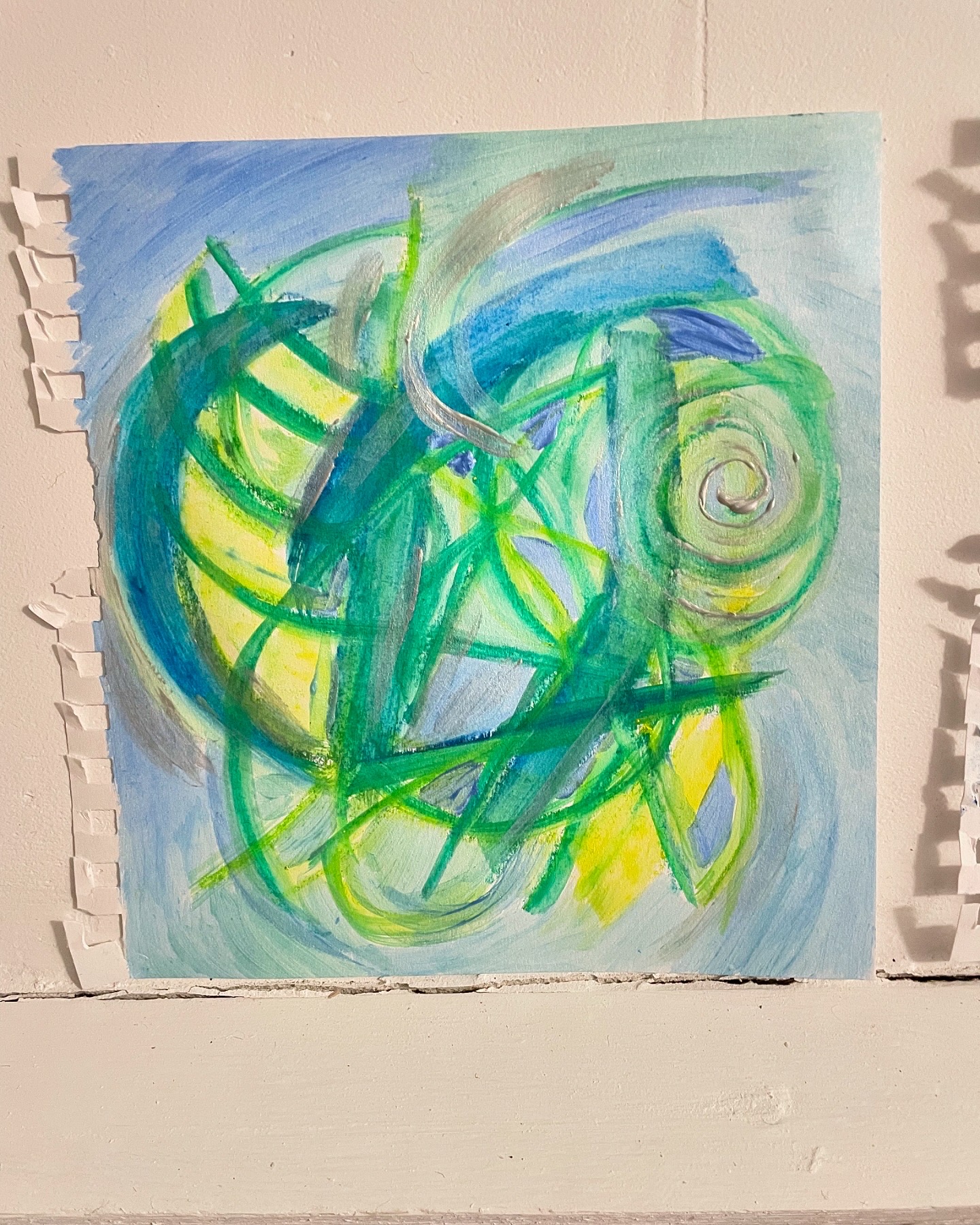
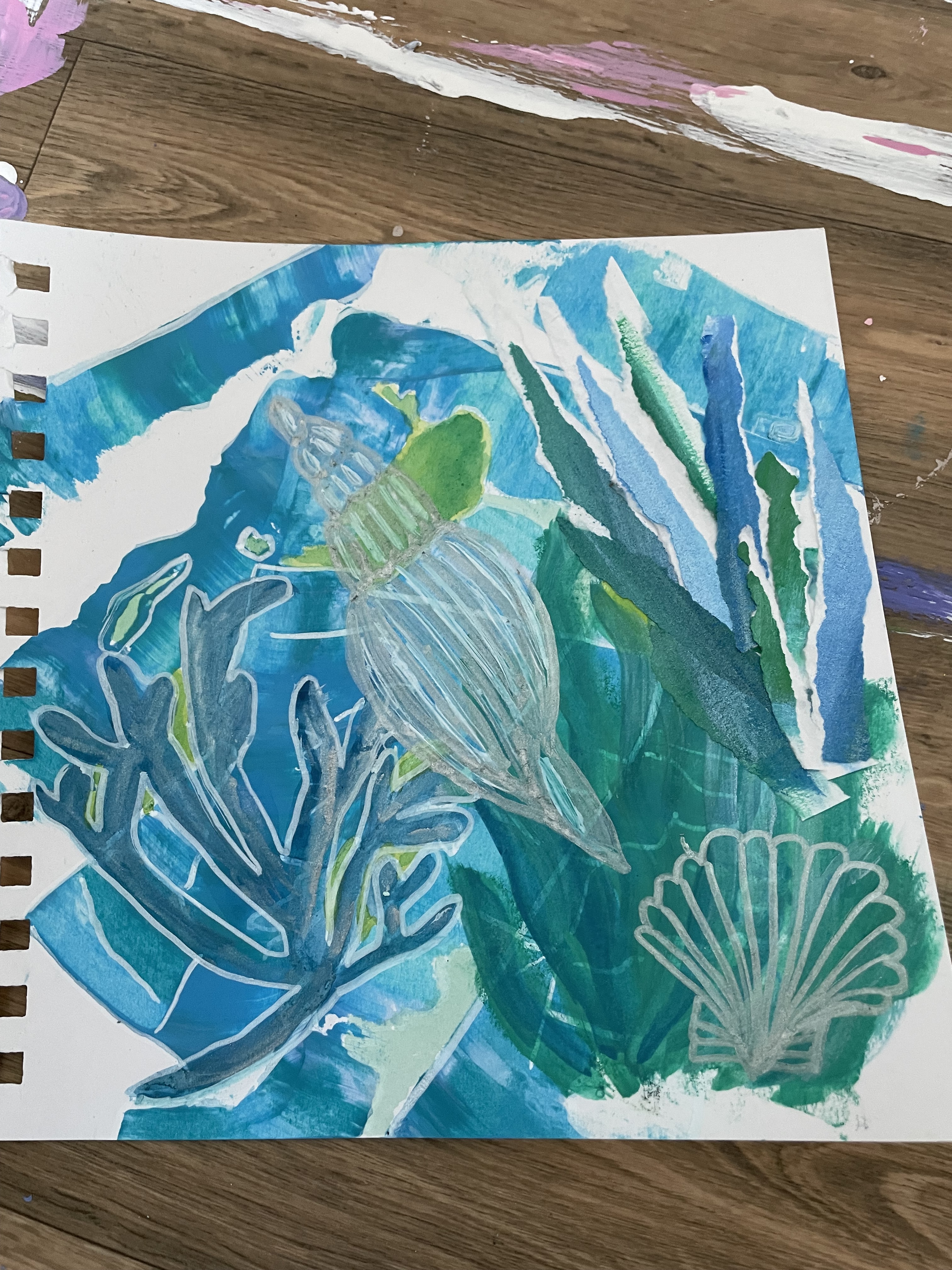
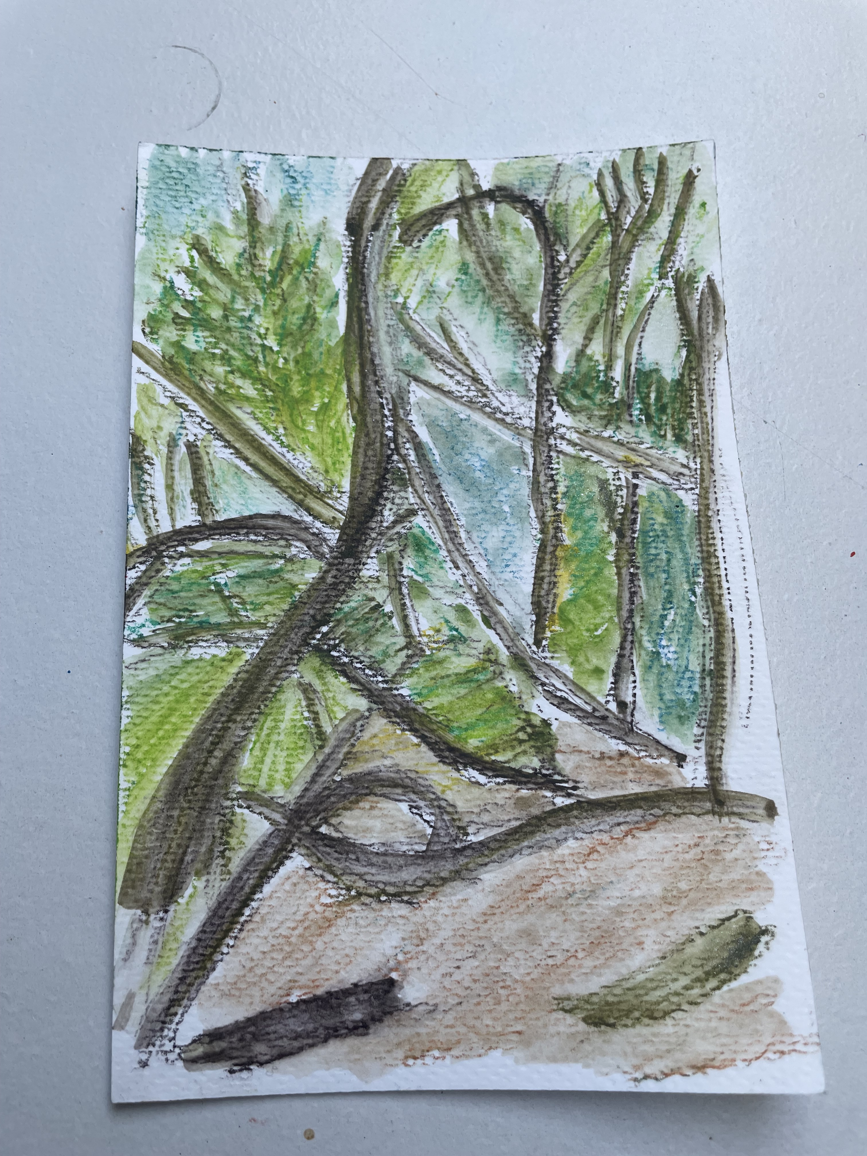
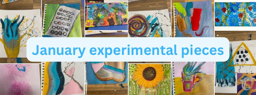
Here are some examples of work i have created so far this year:
All copyrights reserved to ©CLT_Abstracts 2025
Follow me on all social media platforms using the handle @CLT_Abstracts to see more progress videos and photos. Thank you!

I was thinking the other day about how to keep the little kid version of me alive, as a way to inspire creativity and feel excited about life. The things i enjoyed when i was younger were as follows:
Walking along paths with the Brownies and collecting coloured ribbons from the hedgerows and gateways with a sense of competition.
Inspecting the hedges for bugs like ladybirds, dragonflies, butterflies and beetles and getting spooked by a spider i didnt see to start with.
Collecting shells, fossils and pebbles on a family beach day and running along the sand to the rockpools. My brother would have a net and show me a crab he had found or some other creature that was hiding in a nook somewhere. He was good at spotting things and i liked learning about what the creature’s habits were.
Going sunbathing and bodyboarding with my bestie before her leukaemia diagnosis. We would chat about all sorts and take a bag of fun things to enjoy on the beach. This would include anything from crafts, books, snacks, games, music and toys.
Walking around my Grandma’s garden which was full of specially named roses, bought for her by my Grandpa on their anniversaries and birthdays.
Going for walks with my mum and picking wild flowers to take home.
Learning how to embroider a personalised bookmark, that i used in my favourite book ‘Matilda’, which i took everywhere!
Reading everything from fables and fantasy stories to encylopedias/random fact books and yes even the english, french and german dictionaries and thesaurus!
Writing poetry to explore justice fights, the natural landscape and to process life experiences.
Singing and writing songs in the school music rooms during lunchbreak, so i could avoid bullies and feel a sense of achievement and progress which made me happy.
Reading girly magazines in the 90s like Mizz and Sugar which inspired outfits, music choices and usually came with a new lipgloss to try or something equally as exciting for a young girl wanting to be older!
Playing games like Lemmings, Sonic, Duck shoot and a space rocket racing game which i cannot remember the name of at all – But it was really fun!
Watching cartoons like Wacky Races whilst scoffing cereal on the floor really close to the tv and feeling completely immersed in the show. It made me laugh so much.
Choosing wildflowers to put in my flowerpress and seeing how the transform into flattened and dried out versions. It felt like an experiment because it was trial and error to get the moisture absorption right and the timing before the flowers just went mouldy instead. If you tried to reveal them too soon by peeling off the layers of paper or card, the flowers could fall apart if still not dried out.
I constantly wanted to dance to music i heard and would sing along too. I joined dance workshops at school and loved it. I also met up with some girls from school who wanted to recreate dance routines of bands like the Spice Girls. We all fought over who would be which Spice Girl character.
I made dens with my brother or the neighbours out of sofa cushions and blankets. It felt like a safe space although the novelty wore off by the time i’d created the den. Sometimes though, we would make them outside and they became a base where we would meet up or always go to with a ghettoblaster or our bikes.
I’d sit at my dressing table and put make up on pretending i was some kind of iconic Hollywood star or something. I was such a dreamer! The only way i knew how to put make up on was to have the standard blue eyeshadow and pearl pink lipstick. It didn’t look good at all haha!
Redecorating my bedroom with a theme such as dolphin everything! It was very OTT and kitsch. I loved sensory lighting, collecting figurines, band posters blu tac’d on the wall and having a place for everything. It was organised chaos which later became my band name 😀
What are your favourite childhood memories that inspired creativity? Drop me a comment. I wonder how many we have in common?!
Happy January everyone! I had the intention to start the year with the determination to make art everyday and be consistent with you all. I also wanted to be healthier than I’d ever been. So guess what happened! Yes that’s right, I was knocked down for 6 weeks with the flu and I think Covid at the same time! This was only a couple of months after the last time and inbetween that I was in hospital with kidney stones! So I have to reevaluate my approach! 🙃
Whilst I was laid up in bed, with no appetite, a swollen lung giving me pain and asthma attacks every few minutes, I thought to myself nothing on my to do list matters! I can’t do a single thing so I’m not going to try and force myself to. I’m just going to give myself permission to rest. Then I had these words come into my head:
“Even bulbs have a period of time being dormant in the dark, before they are put to use and bloom into the most beautifully scented flowers!”
One of my most recent paintings has another quote by me on it about blooming. So it feels right that I’m coming back to that idea and with Spring around the corner too.
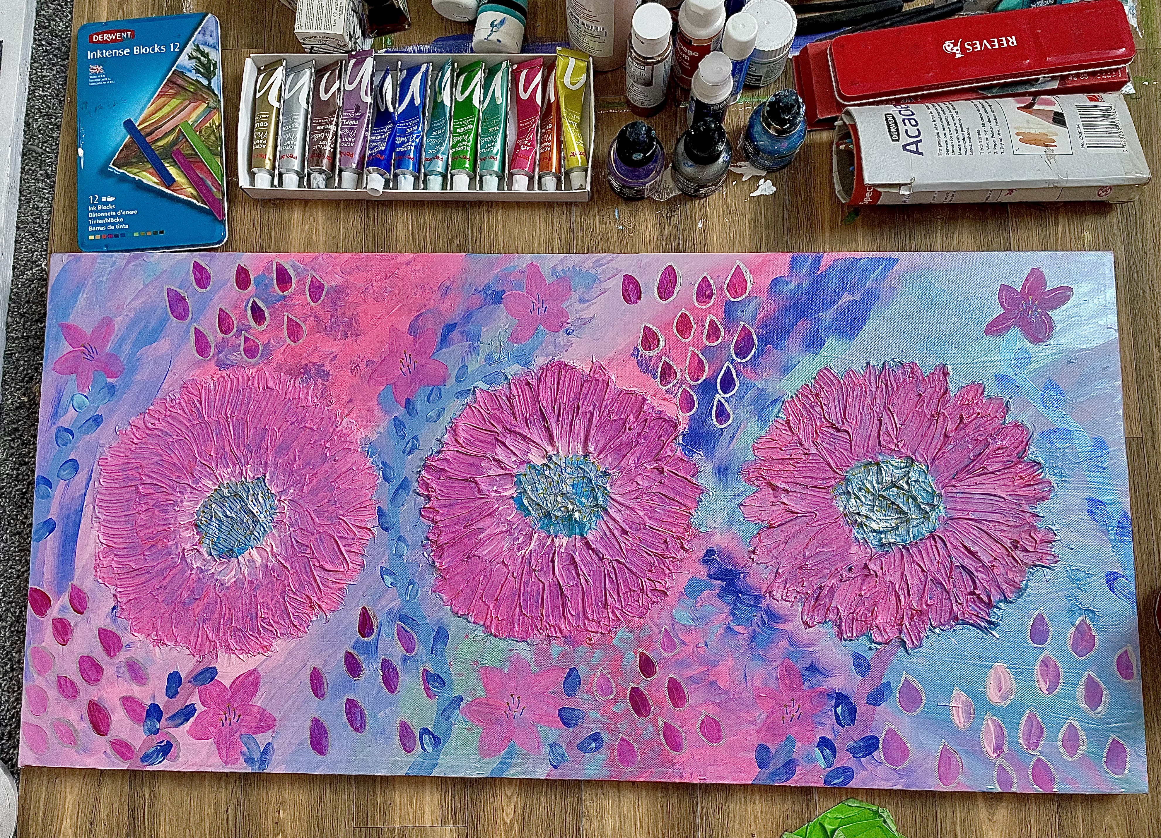
So this week, as I emerge from my downtime, I have started making art as often as I feel I can. I am then blu tacking the art onto the wall in my studio to see the progression. I have found this really interesting already because my styles have varied and one lot of work has a minimal and dainty mark making aesthetic. Whereas the other lot has a smooth, abstract still life shape based aesthetic. I love them both equally but they are very different to each other. I think this happened because on the 2nd lot of work I used charcoal and that takes me back to when I was at uni and drawing with it. So I’m more inclined to create a still life piece or something with intentional marks. Whereas the other art I made was more experimental and unintentional. I really enjoyed the playful nature of all the pieces I have made so far.
I will be continuing making art as often as I can and sharing it with you on my socials so you can see the progression too.
You may notice I’ve made some tweaks to the website too including streamlining my print on demand product lines, adding necessary legal policies and making the overall look a bit more appealing to browse through. Check it out here: http://www.cltabstracts.co.uk
Thanks for following my blog and other social media pages. I appreciate you all so much.
Wishing you all a happy and healthy 2025!
Charlotte at CLT_Abstracts
XOXO
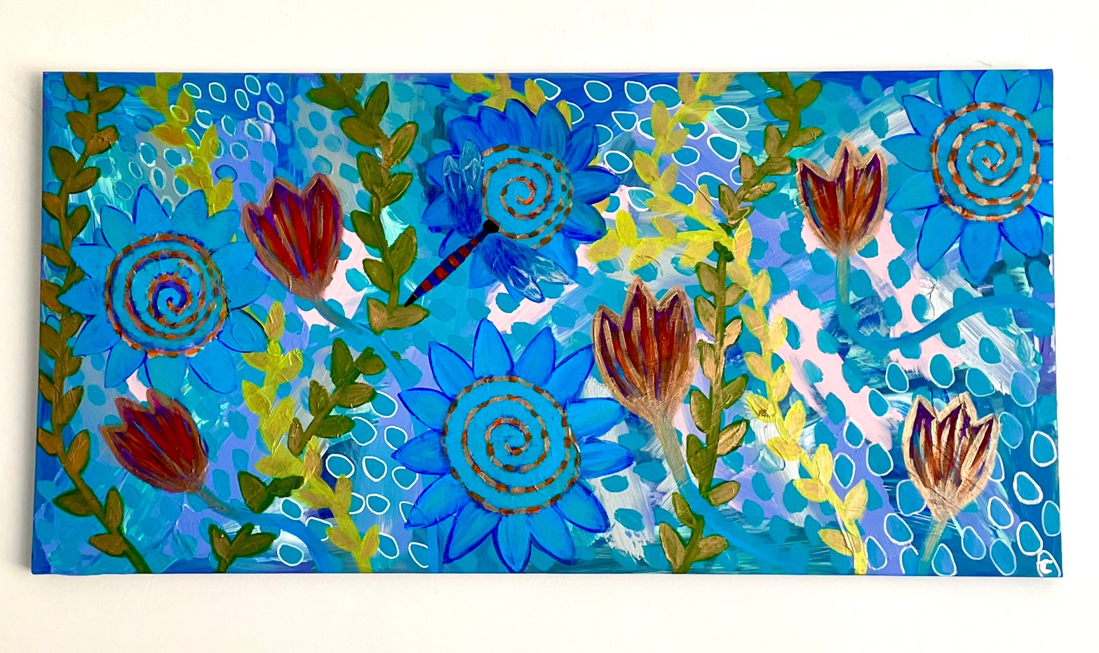

This piece started with a random covering of mostly blue shades with some silver. I had a vague idea of wanting to explore markmaking techniques and have some areas covered up or revealed. I wanted the areas that were covered to be lighter patches. This then developed into a desire to make a layered painting with abstract florals and vines with a maximalist style. I wanted to create a piece of art that would translate well as a pattern for print, so i could then design curtains and other textile products for the home.
I used gesso, acrylic paint, acrylic inks, metallic watercolours and a variety of posca pens. Every time i painted a layer or section, i would build up the depth of the colour and sometimes add metallic touches to show the light bouncing off the flowers and vines. I made the vines wind around other aspects so that the layers were more obvious. It also helped to show movement.
The colours i chose are mostly my signature healing colour palette of blues, greens, purple, gold and silver. I did add some pale pink and white this time too to give the illusion of brightness in some places. The outlined droplets worked well for this too.
Each layer was created to overlap the last one so that there was a sense of foreground and background amongst everything going on.
The larger flowers and overall aesthetic were inspired by a memory of writing to my best friend when we were young and she was ill with leukaemia in hospital. I used to have a writing set i specifically used to write to her with, as she bought it for me for Christmas. This painting looks just like it. Once i realised this, i instantly felt like Claire was writing to me through my art. I’ve always had a psychic ability and received messages from loved ones for most of my life. I really enjoyed adding to this painting each time and to think she was right there beside me as i did it, fills me with gratitude for the work i do now.
One last detail i wanted to apply to this painting was the dragonfly. When i walk in nature, i always see a dragonfly. They usually appear as a warning theres something challenging about to happen. But its also a sign that a loved one is close to guide me. Typically dragonflies represent change especially in the way one understands the meaning of life. So i guess new depths of thought are reached when i go for walks. My brain is very active at these times. It is when i am most creative too. I find it helps a lot when im going through a mental/creative block. I find that dragonflies are pretty good at camouflaging themselves in amongst foliage so i tried to capture that in my work. I love how this turned out!

©CLT_Abstracts (2024)
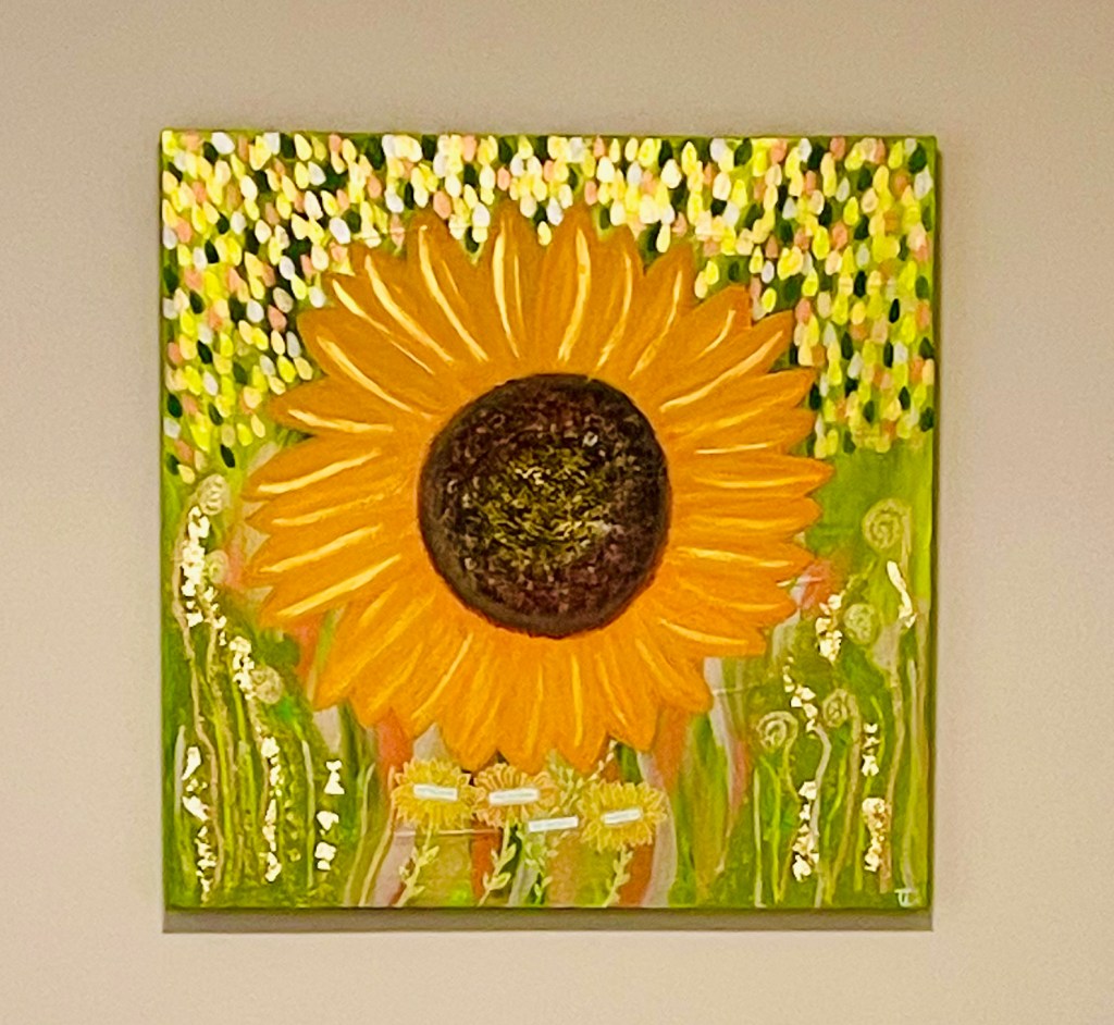
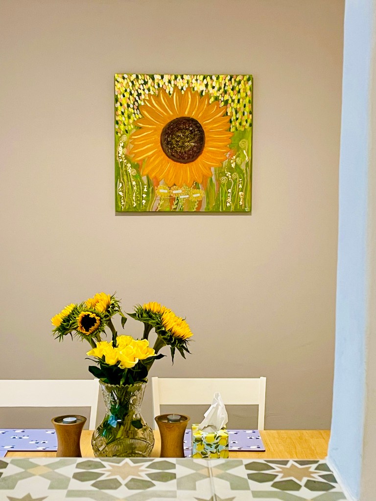
When i was in the process of renovating my new home, I was inspired to have a sage and sunflower themed kitchen/diner. I had seen an image of someone else’s sunny home on Pinterest and from there, I decided to create the perfect focal point for the space. I knew I wanted to have a sunflower as the main theme, but I also wanted to make it a mixed-media painting with collage and metallic areas. I also wanted to include different textures with wastepaper scraps, layers of varying mediums and a quote or poem that has been typed on a typewriter.
I started by adding lime and forest green acrylic paint over the dried gesso. I dropped the paint directly on the canvas and moved it around until it looked like a blurry meadow. I did this to create movement in the background. I also made sure the edges were painted in the same colours so that it created a 3-D effect wrapping around the frame. And then created some shimmering grass like structures at the bottom. Over this I started to sketch out as sunflower shape and then went onto add texture paste onto the Centre as if to make it look like real sunflower seeds in the middle then started to add various yellow and orange shades of acrylic paint to the petals in a smooth manner but again with a 3-D appearance to suggest the sunflower was moving in the wind. I also painted it as if it was at an angle for this reason.
The next part was adding Brown paint with some other metallic shades to the centre of the sunflower as if to show the sunlight on it. I also added almost fluffy like brush marks with a sponge to the edge of the brown middle area so there wasn’t a harsh line there moving in to where the petals are. I then went back over the petals with acrylic marker pens and paint to show the details of the petals. As one of my signature additions is to add metallic accents, I did this on the petals and the centre which made it look more realistic but also quite playful in an abstract way.
Once the flower was created, i then took one of the pages from my sketchbook that I’d previously done with shimmering green watercolour and acrylic ink. I ripped the paper into shredded pieces and wanted to embed them into the painting. So I added texture paste to some mixed green paint and then applied that to the bottom left and right corner areas with a sponge in a dabbing motion. I then pressed the strips of paper into this and dabbed some more texture paste and paint over the top. This created the idea of reeds of grass beneath the sunflower. I emphasised this with varying shimmery watercolour lines over the top and around the sections. I then used Posca pens to draw on abstract curled ferns. To accent these are used small brush to dab on shimmering green and gold marks before adding gold leaf as well.
Around the top left and right sections, and above the sunflower, I used a selection of iridescent acrylics to make small, repetitive leaf marks, as if like raindrops. this was inspired by previous work I had made where I had pressed stencil into texture paste and painted over this to make interesting marks. This time, I didn’t want to use a stencil. I just wanted to paint the marks on. The combination of colours and metallics created a really pleasing aesthetic.
The next area I wanted to focus on was the quote of poem and originally I was going to place the words around the sunflower in each corner. But in the end I didn’t want to cover up some of the nice marks that I had made. I also played around with using stamps and ink to make the lettering but it didn’t come out very well. So, instead, I discovered I could buy green ink for my typewriter and I figured that would work really well with the overall look of the painting. It would add to the meadow appearance. I had some words come to me from my deceased Gran and decided to use them. It says “Darling, bloom into the person you were always meant to be”. I placed them at the bottom of the painting in the centre underneath the sunflower.
The final thing I wanted to add was some Posca pen doodles of daisy like flowers that were built around the words I had collaged on to the piece. Of course, I also added my signature in the bottom right corner in silver for authenticity. I’m really pleased with how this artwork turned out and the overall feeling it added to the space it was created for. The light catches it in such a way, that it almost looks like the sunflower is swaying in the breeze, just how I painted it. I also really like the different sections of the piece and the layers to it, as there is always something new to see each time I look at it. I think this would translate well into limited edition prints. If you would like to see these added to my website, please leave a comment to express your interest Thank you.
Follow for more here:
My website for other artworks: www.cltabstracts.co.uk
My instagram: www.instagram.com/CLT_Abstracts
My Facebook: www.facebook.com/CLT_Abstracts
My TikTok: www.tiktok.com/@clt_abstracts

For those of you who have signed up to my newsletter on my website (www.cltabstracts.co.uk), you will know i’ve just moved house! I’m still based in Truro but my new house has a big studio space. So i have been thinking about what i’d like to paint next! I definitely feel that now i have more space, i have more room for my creative energy to flow.
Since my last blog post, where i spoke about the charity exhibition i was part of in Praa Sands, we raised £2,150 for Cornwall Wildlife Trust and Ocean Generation. So thats pretty awesome to think that money will help to keep the ocean clear of plastic, raise awareness about environmental issues like that and protect the humpback whales and other wildlife. Moving forward, i would like to continue with the sea theme and create a body of work focussing on the movement of the water, the light reflecting off the water’s surface and the beautiful colours that come from the Cornish coastline.
Another project i would like to start is creating a frequent diary of paintings as a way of expressing a response to world news stories, places i’ve been/photographed and how i’m feeling on that day. I have always underpinned my work with thoughts on climate change, news stories and social issues. I want to really focus on this and see a progression in my timeline of work.
I also had a thought that i would create a response to poetry i come across. I have ordered a book from my local library which has a collection of poetic reponses to others poetry. I thought this would be an interesting method for painting as well.
Lastly, a friend of mine keeps asking me if i’ll do a painting of a VW vintage car for him. I’ve explained i dont do art that is representational because in my head, if you want a picture of a tangible thing, you can take a photo. No disrespect to other painters who create this sort of art. It just isn’t my usual go to. BUT, i was going to extract aspects of cars and other objects to see how they come out. Maybe that would inspire something else too.
Sooooo, lots to think about and get cracking with! My head is spinning! 😀
Finally, i’d just like to say thanks for reading my blog posts. I have just signed upto TikTok if you’d like to see videos of me painting future work.
Follow me here: https://www.tiktok.com/@clt_abstracts
New exhibition this Spring!
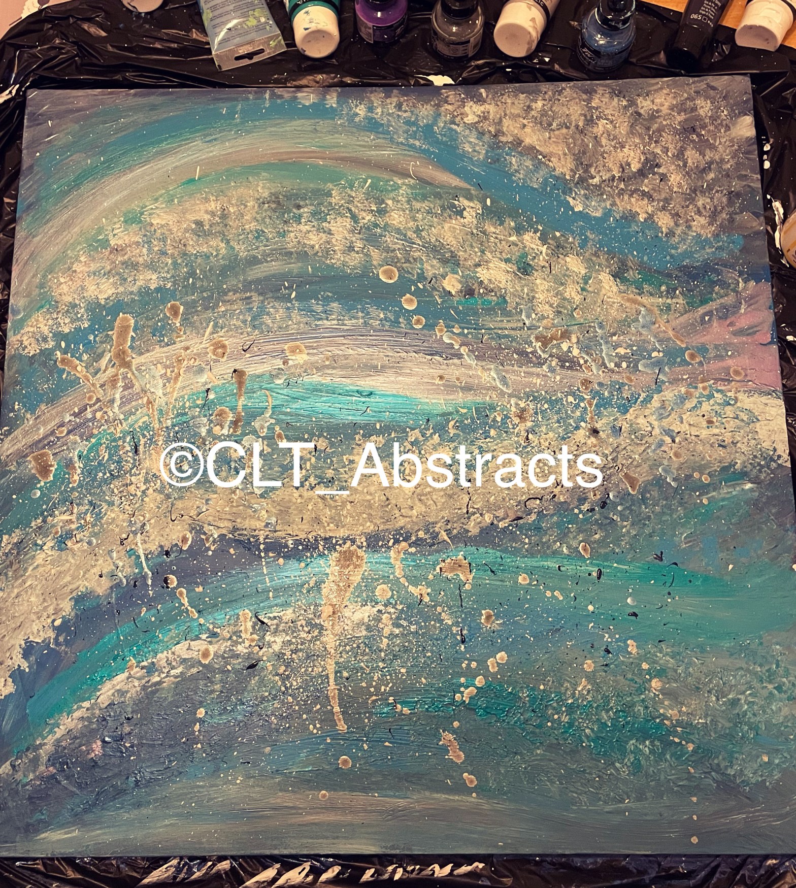
I joined a Facebook group called Creative Cornwall whilst trying to network and connect up with other artists. I was really happy to find such a welcoming and humble mix of talented individuals that I could socialise with and learn from. Being part of an exhibition with them was an unexpected bonus. We were asked to create a piece with the theme of the sea and whales. All of my work is underpinned by the influence of the colours on the Cornish coast as well as the urge to do something to help the climate crisis. I tend to paint over old canvases and use up scraps of things to create texture. I also like to make art that comments on the changes in climate or other world events and conditions. I am really pleased with how this piece came out as it has the right level of drama and spirit of the sea, with complementary colours and my usual sense of motion within it. (See below)
New piece – ©Island Storms (2024) by CLT_Abstracts, Mixed media on reclaimed canvas, 60cm x 60cm x 2cm
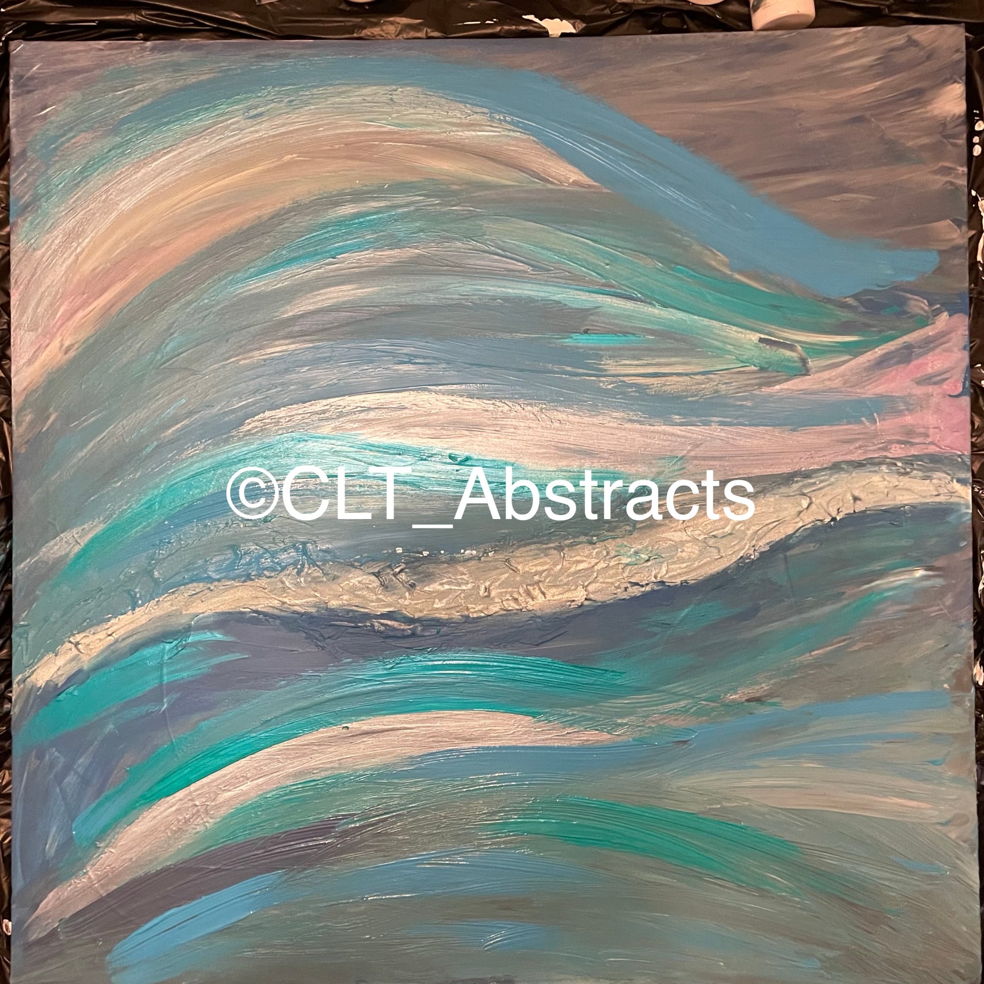
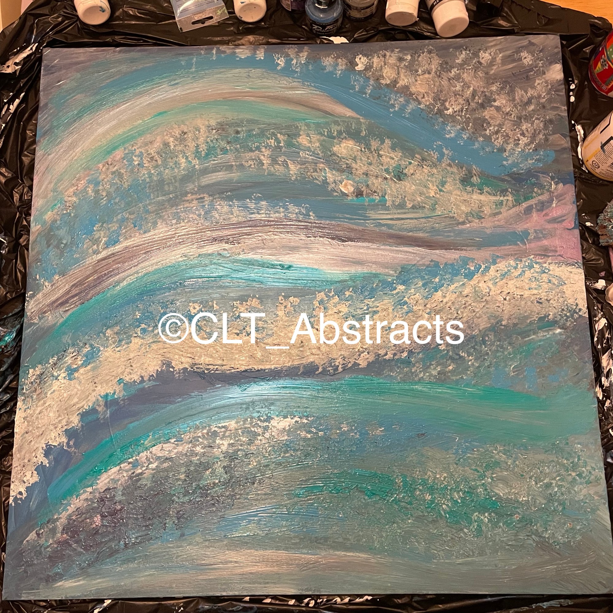
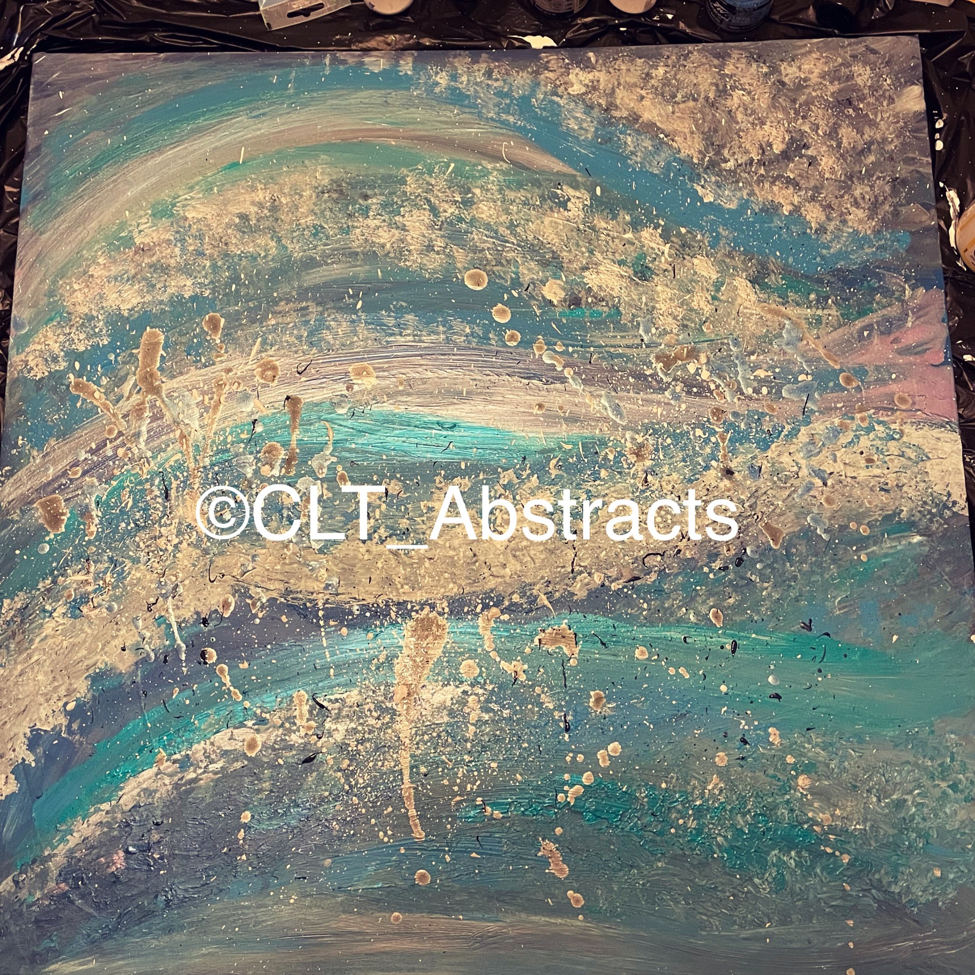
As you can see, i have started with smooth strips of colour to give the sense of movement and waves. This was done over a layer of gesso and a strip of texture paste through the middle section. I used a mix of acrylic paint, liquid acrylic and some irridescent paints. I don’t usually use a brush because of the cramps/shooting pains i get up my arm but this time i had to grin and bear it to get the right effect. It also helped to blend areas of paint and liquids. I then used an old sponge on the wet thick layers of paint to pull at it and reveal colours underneath. It also helped to move the paint around and create this fluffy cloud and sea spray effect. I was almost going to stop at this point but then i knew i was yet to use the liquid acrylics in my usual drip/splash method. I also wanted to add my signature metallic areas for that added dimension of light.
As my work has progressed, i have found that i am enjoying making my artworks more and more and this is my favourite piece i’ve ever created. I hope you like it as much as me. Feel free to leave feedback here or on my social accounts on Instagram and Facebook. This piece will be exclusively available from the Creative Conservation exhibition at The Welloe, Praa Sands, Cornwall on Sunday 18th February 2024, but if you cant make it in person, it will be on he exhibition website too. To read more about the charities benefitting from the exhibition sales, please go here: https://www.cornish-times.co.uk/news/creative-conservation-art-exhibition-inspired-by-whales-664520
To purchase art from the exhibition and see what was created: Charity Art Auction
My website for other artworks: www.cltabstracts.co.uk
My instagram: www.instagram.com/CLT_Abstracts
My Facebook: www.facebook.com/CLT_Abstracts
