Let’s make room for 2024!

As a business owner and artist, doing everything single-handedly, whilst juggling multiple chronic health conditions, I have been curious to see what AI apps can do for me to lighten the workload. I have to say i am pleasantly surprised with how it can inspire real life artworks and help with marketing material. I struggle with word finding every day. The most basic words fail me sometimes. Always on the tip of my tongue. It drives me crazy that i cant always speak my own first language. So, despite the negativity around AI i have welcomed it in as a new way to support my work and peace of mind.

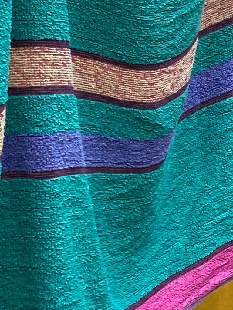
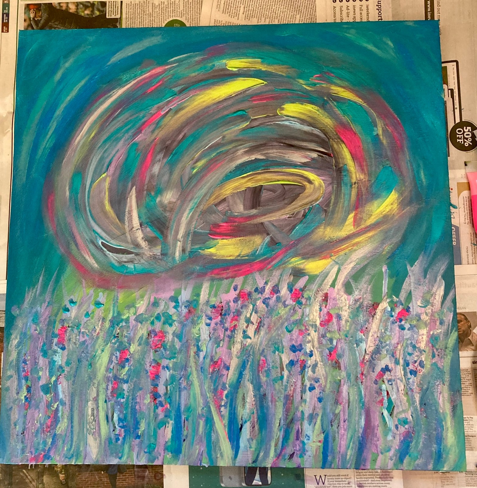
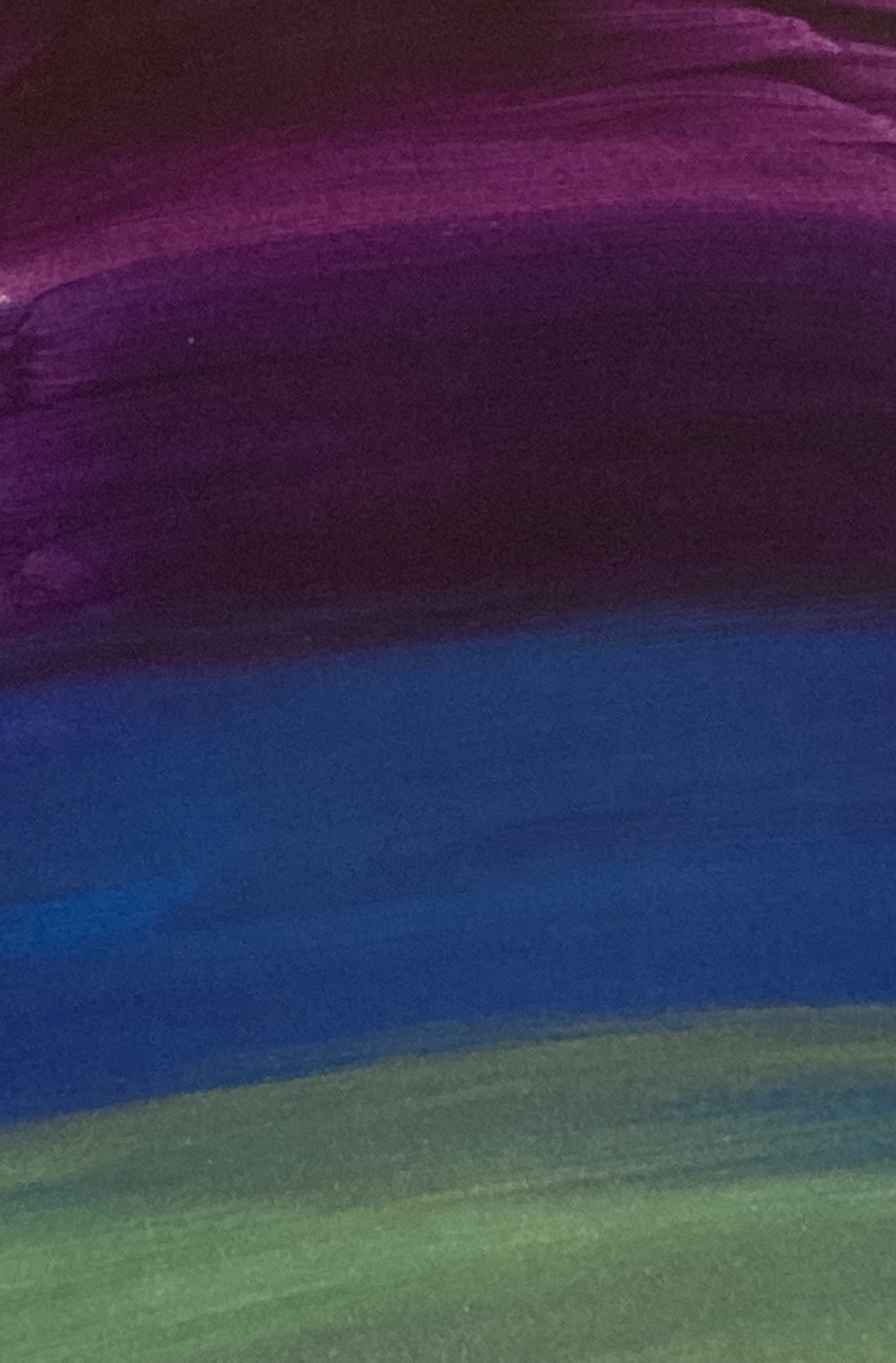
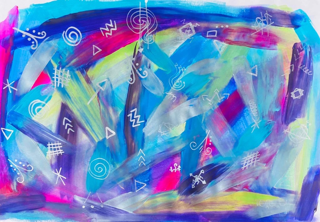
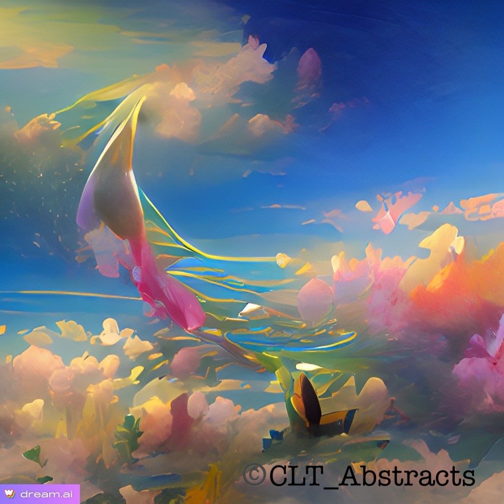
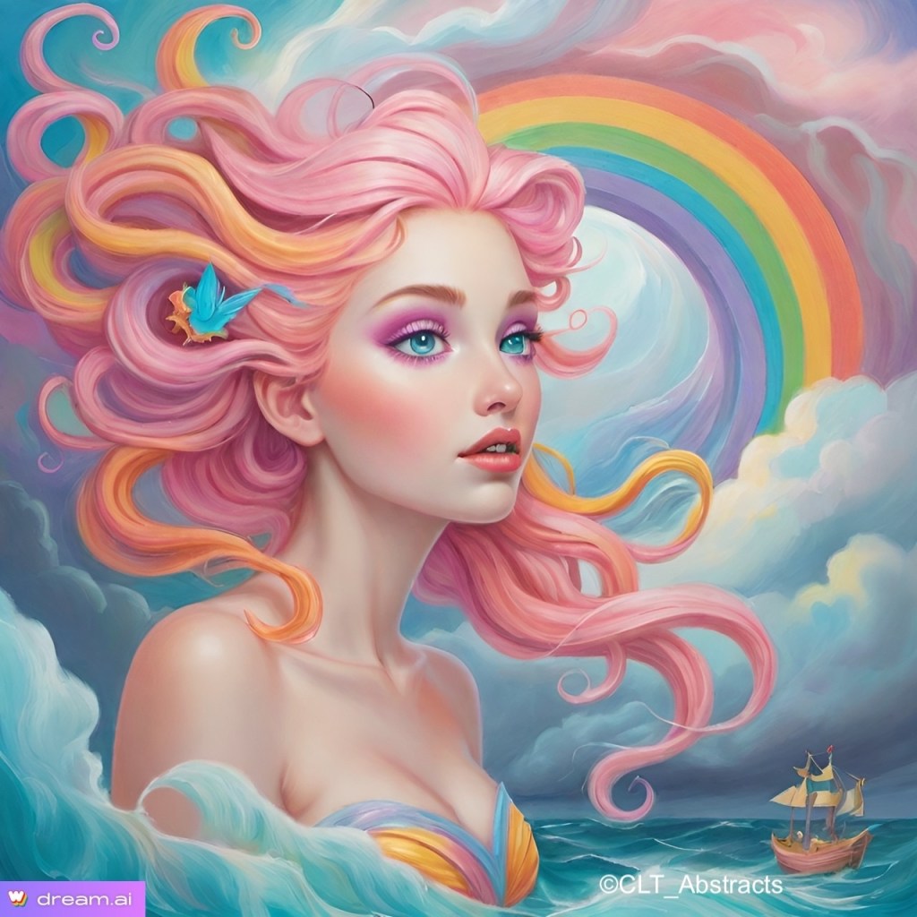
But don’t worry, I won’t be letting Ai take over completely and make my art for me! Hell no! But it has its uses in terms of inspiration and time management. I would like to use the image above as a basis for a painting because i think it would be really fun to create. Even if it went in a totally different direction mid painting, which tends to happen in my work because they are intuitively made. I think it will help to eliminate creative blocks.

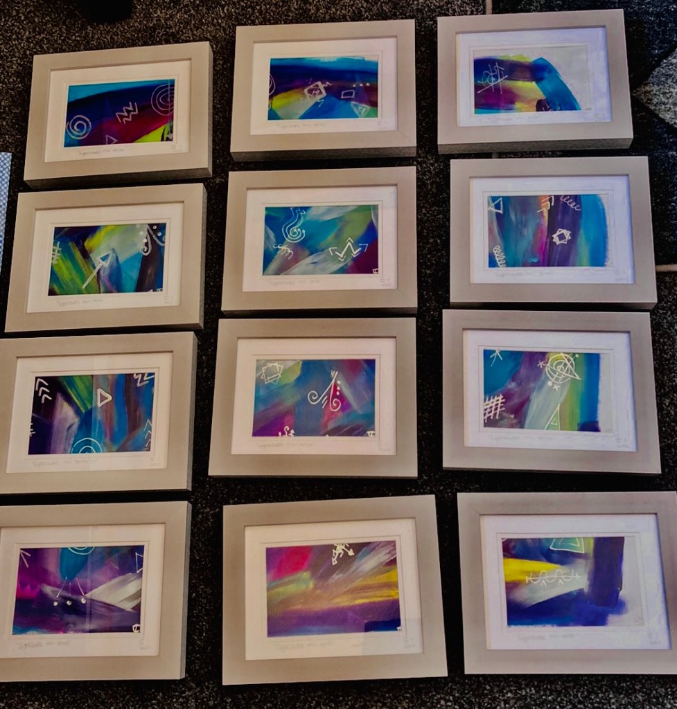
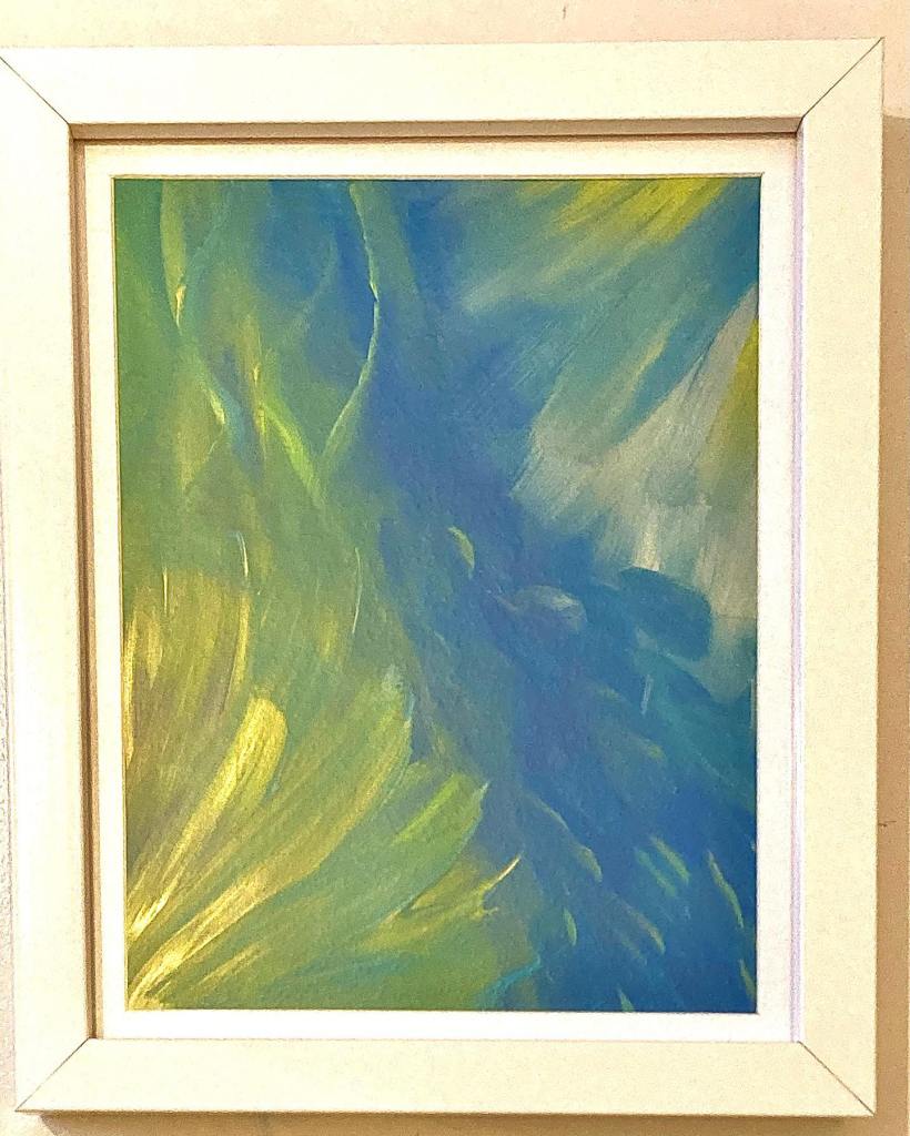
You may know that i like to design Print-On-Demand products now too. You can find my current designs on my website here: https://www.cltabstracts.co.uk

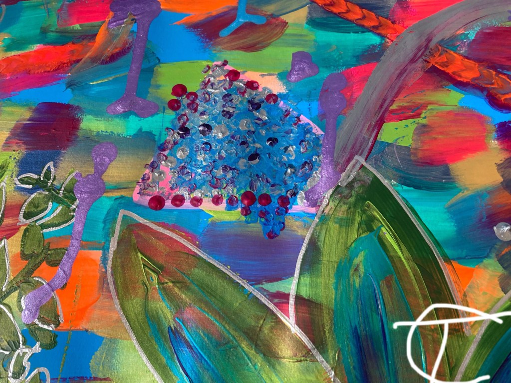
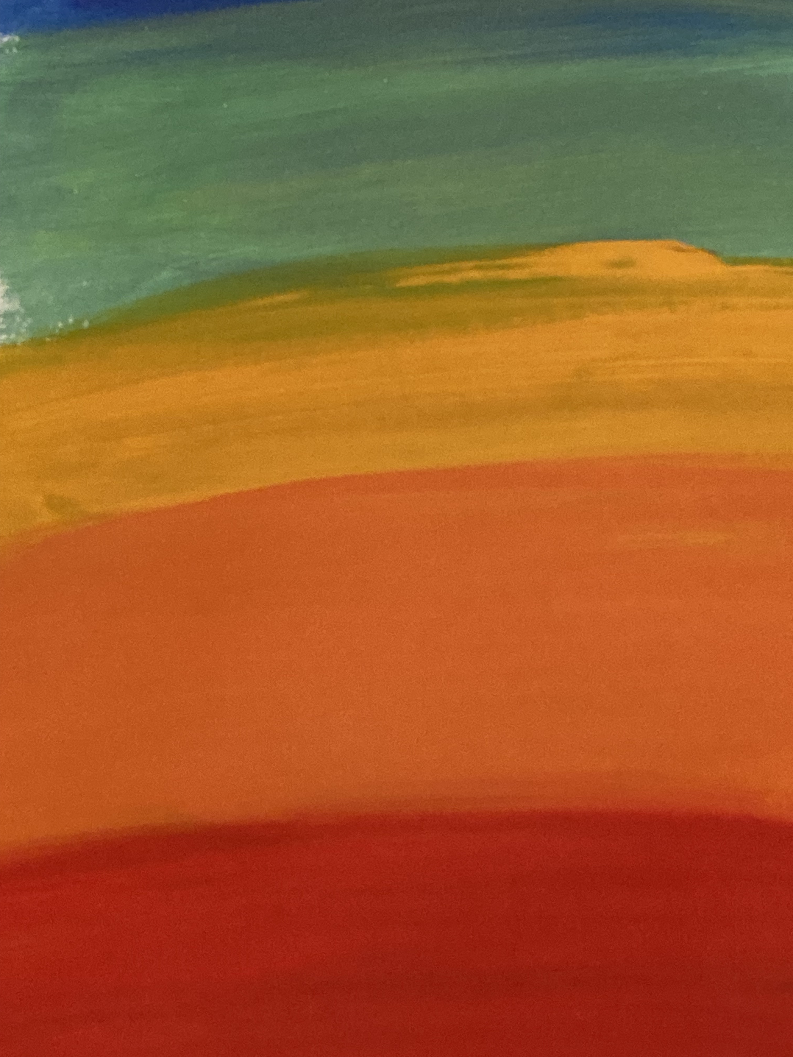
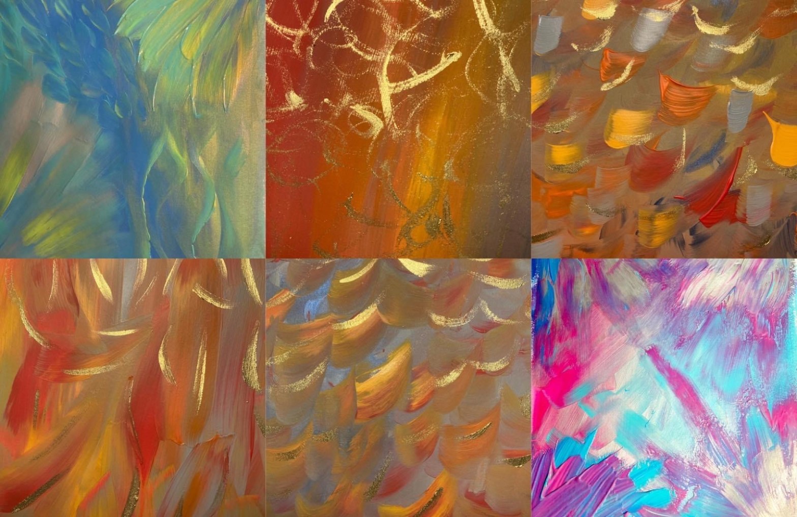
I think incorporating Ai images into my product designs could expand my collection with some really vibrant ideas. I am currently working on a range of hoodies. I want them to be environmentally sustainable, super cosy and fun to wear. If you have any specific requests for designs, feel free to msg me on instagram or Facebook and let me know what you’re keen to see available. I love doing custom work and commissions. All the links are on my main site to get in touch.

Thanks for reading! Don’t forget to subscribe! 🙂

Mindfulness painting workshops coming up

Over the last month or so, I have been taking part in weekly Mindfulness for pain sessions via the NHS. When I was first offered them, I was pretty reluctant to try them because I didn’t think it was what my life or mindset needed. I was hoping for a different kind of therapy or help from the doctors to help with my symptoms and the root cause. I have always struggled to get doctors to listen to me and several chronic diagnoses later, I still get frustrated with the process. I have dealt with chronic pain and fatigue for years and I’m very in tune with my body as a result of living with that. However, what I didn’t realise was that mindfulness can help to refocus the brain to the positives around me and unlock the creative part of my brain where contentment can be found.

Throughout the course, I went to each session with an open mind and really tried to focus in on what was being said. I usually struggle to sit still for too long (undiagnosed adhd plus physical discomfort) but I was surprised to find the sessions really engaging and exciting! I even went for mindful walks with my partner afterwards and started to notice features on the houses on my street I had never noticed before. The joy I felt from being so present was really nice. I also had this same joy when I was taking part in the visual mindfulness task on the course. I felt my mind go from an extreme state of foggy fatigue to full of inspiration from things I could see in my house and garden! It was incredible to have my brain switch like that. I would usually give in to that fog and have a nap or stare into space feeling rubbish. So now I have this great coping mechanism.

As a result of this discovery, I started to ponder the possibility of hosting mindfulness painting workshops. The next thing I know, a message pops up on my phone about being a workshop facilitator for Youth Art Connect who I volunteer for. They help children and adults with their mental health through accessible art sessions. I suggested hosting mindfulness painting workshops with them and they said yes! It’s a dream come true to combine my history of care work with my current role as an artist. Helping people through my art really makes me feel fulfilled.

I am pleased to announce that my first session with Youth Art Connect will be Monday 25th September – Bookable from YAC’s website. These sessions will be every Monday up until Christmas at Old Bakery Studios, Truro.

I will also be hosting some Microsoft Teams sessions for anyone who can’t make the in-person sessions – These will be bookable via my website. Please go to: https://www.cltabstracts.co.uk

Oh and 1 more thing! The random photos at the top of this blog post are the things I noticed when doing the visual mindfulness task. There were so many textures, colours and patterns around me and so I took snapshots of them and then created a layered painting based on them. The possibilities are endless! It’s magical! I can’t wait to share this technique with you soon 🥰

Website Launch!!!!

OMG I’m soooooo excited!! 3.5 years ago in the midst of the pandemic and personal burn out i gave up working for others, as it was really damaging my health. I had no idea what i was going to do next because i could barely function and all the jobs i’d typically turn to, i had exhausted and they had exhausted me quite frankly! So i contacted the job centre at this very difficult time and asked for help in any form i could have it. They supported me to get help to create my own business and occasionally i would get little pots of funding to help me along in that process. I came across a local company called Outset Cornwall who took me through all the things i needed to know for setting up, running and developing my business. I also had help writing business plans, cash flow forecasts, funding forms etc. Eventually i started to get the hang of what i was doing because it was all new to me and this helped me grow in confidence on my new path. I managed to secure funding to help build my website, including the shop, so i had a consistent place to sell from that was convenient for my customers across the UK. Many thanks to Naomi at Brown Box Business Support by the way for helping me get the website finished.

I am now ready to LAUNCH MY WEBSITE!!!! Aaaaaaaahhh!!!!!! This is such a huge milestone for me and it’s really exciting because it means i can really test my business with consistent sales and see where i can take it. I have always wanted to work in a job where i could be creative, use my art degree and have it work around my health and future family. I want to become successful enough to provide for my family whilst working from home.

I have worked really hard to make a sustainable art collection with my original abstract paintings on canvas, limited edition prints, locally printed tote bags and post cards. I also added in some budget-friendly, framed originals on paper known as my “©Lightcodes mini-series” which look absolutely stunning! Since creating these, i’ve diversified into the realm of print-on-demand so that items are only printed as they are needed and therefore fresh for you, whilst the environment is protected from waste. At the moment, i am doing this via Printful but i am also looking into developing my product line further with other fulfillment companies like Gelato who i’ve heard great things about. The wonderful thing about using a print-on-demand service as an artist is that i design the items with my own artwork on, then the company makes them and ships them out. This helps me as a disabled artist to keep up with demand. I am always looking for new ways to do this and also conscious of keeping things sustainable or local if its an available option. I have tried to design only eco friendly items, with minimal exceptions if it helps to keep costs to a minimum for you as well. I have also been keen to design products shipped from UK to keep custom fees away and carbon emissions as low as i can. So, where this hasnt been possible, i will source my POD fulfillments from other companies to ensure this as often as possible.

I would love some feedback on my site and would also love it if you would sign up to my newsletter on there to hear about new products and exclusive discounts. Please check it out using this link: www.cltabstracts.co.uk

Don’t forget to check out my facebook page here: https://www.facebook.com/CLTAbstracts and my instagram here: https://www.instagram.com/CLT_Abstracts/

I would appreciate any new followers, post likes or comments and shares. Thank you for your continued support. I hope you enjoy my fun little creations and they become a lovely addition to your home or work space.

Chakra Mobiles

My good friend Claire at Aura Energetics in Glastonbury asked me to create some items for her shop to sell. She wanted them to be connected to her chakra/aura theme and so that involved using bright rainbow colours and intuitive making processes. 🌈💖🌈

Originally, we spoke about painted wooden coasters but unfortunately the materials I had just weren’t adequate for the task so I decided to play around with textiles. I was feeling drawn back to using felt which I had dabbled in at uni. But this time I wanted to use ready made felt sheets and pretty ribbon. I thought I’d make some mobiles to hang in the shop window and for customers to decorate their homes with. I love home decor and this plan suited the needs of Claire’s shop and it was something different to challenge me. 🧵🪡📍

I researched the chakras, what they represented and what colours they were. (See previous post discussing this) I then thought it would be nice to offer love through my work because I like to show that I really treasure my customers and I want to manifest ✨love✨in their lives and homes. The world needs more love and light in my opinion. So I started cutting several hearts from the felt and then arranged the coloured pieces on the strips of ribbon in the order of the chakras and whizzed them up on the sewing machine. I chose some rainbow coloured ribbon and some slightly wider lilac ribbon with dragonflies on. Both were significant to me because the chakra colours are included in a rainbow and it was also the time of year for many Pride celebrations 🥰🌈🏳️‍🌈💖

The dragonfly design spoke to me too because when I walk in nature and see a dragonfly, something magical always happens next. I see them as a sign of the magic that is to come. 🪄🐛🦋

So to offer this to my customers made me feel very excited! 🥰🤩

As you can see from the photos, they are looking beautiful in Claire’s shop (Aura Energetics, Glastonbury) and provide some lovely cheery colour to add a boost of happiness to your day! They are about 1 metre in length with a ribbon loop at the top. They look great on the end of curtain poles! Or you can just pin them to the ceiling or hang from a nail, picture hook or door handle.

I hope you enjoy them!

🩷💜🩵💚💛🧡❤️

©’The Space Between Us’, 2023, by CLT_Abstracts

This piece came about when i joined Youth Art Connect CIC at their neurodiverse, adult art club. I am specifically interested in joining up with local creative communities that are inclusive and this one matched up perfectly. I also like being in a space where i could make a mess and not worry about it. Plus, i was curious how my art would unfold whilst being amongst other makers.

I started off with a medium-sized, reclaimed square canvas that had a print of Marilyn Monroe on it. I chose that one out of a stash of old charity shop canvases because i liked the symmetrical aspect of working within a square and it was mostly white, so easy to cover. I added some white gesso so that it didnt look porous when i added the paint after. Sometimes printed canvases can take several layers of paint to cover otherwise and i didnt want to waste paint. I was drawn initially to a matt pale olive with an iridescent green yellow, iridescent green blue and cerulean blue. I think this was brought on by the turning of the season into Spring and my walk beside the sea to the workshop. The colours felt eyecatching and fresh.

I then had this urge to paint a windswept flower meadow on the bottom half of the piece, even though i dont do representational work usually. So i went with it. I also knew i wanted to use bright clashing pinks and purples for the flower petals. Once i had done this, the workshop was up and i wasnt happy with what i’d created. I noticed that i felt the pressure of expectation to create representational work, because in a group setting its easy to think youre being judged. Especially as a new person in the group. Whilst chatting to someone there, it came up that its ok to put the work to one side and come back to it or even scrap it altogether. But as you know, i like to paint over reclaimed canvases and will keep painting the same canvas, even if it changes completely (which it usually does!) So i took it home, i set it to the side and then came back to it a few days after and got really in the zone! In the gap of time when i wasnt working directly on the canvas, i played around on my new electronic drawing pad. I created an area of sweeping hues all blended together that reflected the news stories covering the Northern Lights, which had been seen all over the UK, including Cornwall that day. I then thought about how it would look great as a background for a digital print perhaps on a slogan t shirt, tote bag or as a printable. So this is something i will pursue this year and eventually have available on my website.

I took the Northern Lights design and then thought maybe i could recreate it on the canvas i had started at the workshop. It had the perfect flowy shape that i had hoped to add to the top half of the canvas. I also added acrylic ink drip lines amongst the flowers with brush line flicks and dabs. The piece now has the more abstract feel i hoped to make, with a recognizable colour palette inline with my older work. The whole composition reminds me of the Lent series i painted a couple years ago and it is Lent again now. So thats a spooky realisation.

What i noticed when i stepped back from the work to take progress pics was that an eye shape had formed in the centre of the Northern Lights section. It is what i like to call a “happy accident!” But it also adds to the message the artwork was sending me. I feel that the flowers/meadow part represents the expectation to be “normal” in society, whereas, the Northern Lights part is the “alien/outsider” feeling trying to fit the mould. The eye makes me think of being watched over by passed loved ones and the grief of missing them, but also peering into society from the outskirts or simply being stared at for being different and misunderstood. When i realised this piece had all these aspects underpinning it, i realised it was perfectly aligned with the “Neurodiversity” exhibition of which i will be entering my work into on Easter Sunday 2023. This will be at Old Bakery Studios and money raised from sales will be split evenly between the artist and Youth Art Connect CIC to continue their fantastic art clubs. I am thrilled to be part of it!

The next stage, for this piece to feel complete, is to add some silver leaf, as that is my signature way of giving the effect of light and dark in the work. Please follow my instagram and Facebook accounts for updates. Just search “CLT_Abstracts”, click “follow” and then drop a comment to let me know what you think. Thankyou!

Chakra Research & Ideas

I have been reading several different books about spiritual things, chakras, auras and healing lately. I’ve always dabbled in these practices but wanted to learn more for a specific art project i’m working on. I’ve been asked to create some chakra art for my friend’s shop in Glastonbury and so ive been mixing paints to create the exact shades of the chakras, looking at the chakra symbols (aka yantras) and learning about energy blockages. As someone who has suffered with various chronic health conditions all her life, it makes sense to me that by clearing the stagnant energy at certain chakra points on the body, the ailments would start to dissipate also. I believe in creating harmony and balance in my body, but also in my paintings, to achieve healing.

Chakra facts from ‘The Chakra Project” by Georgia Colleridge that i found fascinating:

Chakra means ‘wheel’ in Sanskrit.

The Yantras/chakra symbols are geometric formations and each one includes a centre point representing the universe, triangles showing directional energy, squares for North/East/South/West, the moon stages and varying amounts of lotus petals. When each yantra is focussed on in meditation, it can act as a deity and can transform the flow of energy at the chakra point.

Chakras are spirals of light and as they spin, they draw energy in and out of the body.

The chakras are made up of 7 colours and represent the following aspects:

Violet-white: Crown/Brain stem/Spiritual compassion, joy

Purple: Third-eye/Eyes, pineal gland, brain/Perception, intuiton, dreams, wisdom

Blue: Throat/vocal chords, mouth, bronchial tubes/Expression, communication

Green: Heart/Heart, lungs/Love, internal reality, relating to others

Yellow: Solar plexus/Liver, stomach, intestines, pancreas/Power, identity, self control

Orange: Sacral/Bladder, prostate, ovaries, spleen, bowel/Sex, feelings, creativity, adaptability

Red: Root/Spine, testes, kidneys/ Survival, security, acceptance, confidence

Id like to incorporate these ideas, colours, yantras into my chakra art and attach my own affirmations that i think correspond well to each one. I’m playing around with thoughts on spirals, circles, triangles, stripes, dreamy sky backgrounds, plus some shiny areas of silver to emanate light/energy or the moon. I might even add in the mantras for each chakra. I want all of the aspects of the chakras to be available in each piece of art.

There are 6 important aspects of each chakra which are:

1/ Colour

2/ A specific amount of petals

3/ Yantra (geometrical shape)

4/ Beeja mantra (sound vibration)

5/ An animal symbol that represents evolution and instincts

6/ A higher/divine being representing higher consciousness

You can rebalance the chakras using mantras (sanskrit chants), meditation whilst looking at the yantra/chakra symbols, pranayama (breathing techniques) and asanas (yoga poses).

You can read more on this at yogasigns.com where i found some of these facts.

©Lightcodes Mini-Series 2022 by CLT_Abstracts

From this:

To this:

I wanted to create a series of originals on cartridge paper, cut from one painting, that i could frame and have ready to go for you. They are mounted, signed, named as “LightCodes Mini Series” and one-offs. I thought my customer base would appreciate a smaller, affordable selection of original artworks, with no faff after purchase. I also wanted to offer a highly collectible option that was literally, and metaphorically, part of a bigger picture. So then the buyers are all connected through the art and have an “experience” of togetherness. In my Buddhist practice, there is a concept called ‘Many in body, one in mind’ which i was thinking about when i was making this series. Here is a quote from the Writings of Nichiren Daishonin, Vol 1:

In his writing known as Many in Body, One in Mind, Nichiren states, “If the spirit of many in body but one in mind prevails among the people, they will achieve all their goals, whereas if one in body but different in mind, they can achieve nothing remarkable” (618). ( Read more here: https://www.nichirenlibrary.org/en/dic/Content/M/63 )

It basically means that if people work together or take action based on the same values or goals, anything is possible. However, if everyone is singing off a different hymn sheet then barely any progress will be made for humanity as a whole. You can have an impact as an individual but your actions have more effect in a group or shared vision. I love the fact i can attempt to bring people together via my art and creativity and you can too! So if youre reading this as a fellow artist, keep creating and sharing your work with the world, because the world needs it. It is very healing and uplifting. It builds connection. I can’t think of anything more important than that.

The piece as a whole was one of those that came to me as an intuitive impulse and i had no say over any aesthetic aspect of it. I just kept painting in these bright hues and sweeping brushstrokes. It had this vibrant energy and excitement in it. I really enjoyed painting it. Once i’d finished the first layers with acrylic and that had dried, i had another urge to draw symbols in silver pen. I didnt know what they meant at first, or why i wanted to draw them, but i had to get all the symbols down on the page and then the word “lightcodes” kept coming up. When i looked into this, i discovered that they are used as a form of communication between the ether energies or spiritual guides and those of us who are like messengers on Earth. As i was in a trance-like state whilst painting this piece, I believe it was because i was channelling light for all who go onto own each part of this mini series. I believe we are all attuned to the ascension we are going through and therefore will form a collective through the work. This really excites me and i cant wait to find out who you all are and where this takes us!

Kicking off 2023!

Another year, another fresh set of dreams and ideas…where to start?!

I wanted to hit the ground running this time after a few years of bad health, many business set backs and some heavy, personal momentum-breakers. I knew i wanted to have a consistent work ethic and content, plus a new collection.

It got me thinking about what gave me the urge to paint at the last house. Since i moved here to a smaller place, my creativity has felt squashed and pushed to the side. I know i can’t blame life events, as we were in the height of the pandemic when i made the first collection. I know that being confined to a small space is a big factor but recently it has helped as a way of squeezing out the inspiration that would otherwise be stuck inside of me.

So, i thought about the themes of my previous work and how i was feeling back then. Freedom, escapism, bright and healing colour palettes, textures, an eco approach with using up scraps in mixed media work and a desire to break the mold were all apparent. But what it came down to was painting whatever felt intuitive and channelled, rather than painting for a specific brief, commission or any size/colour/space constraints. I finally felt free again! It has been liberating!

I was offered a chance to contribute creatively to an upcoming Buddhist event by making bookmarks and i jumped at the chance! I painted whatever was within me to paint and reached for an unusual colour palette of autumnal colours with gold. I really enjoyed the mark-making within the work and also painting onto cartridge paper instead of canvas. It felt playful as if experimenting in a sketchbook and i let go of envisioning the final outcome ahead of time. However, it felt important to consider some aesthetic composition values to give the pieces balance and once i’d covered all bases (i.e symmetry, complimentary colours, light and dark, texture, areas of interest), i would consider the work finished.

I did the initial layer of wet-on-wet acrylic and then when that had dried, i added the gold painted flecks. I did several pieces with each one seeming moody but energised with a sense of being submerged in partially-murky waters, seeing the flow of the ripples and the light hitting the surface above. I guess it mirrors how i was feeling with the January/general life blues after several close family members died within a space of two weeks. But the movement and expression in the work felt so soft and warm so i will incorporate more of this in future work.

I tend to turn to colours to help, and change up, my mood whether i wear them or paint with them. At the start of January, the Pantone colours were released and popped up on Instagram. I am a sucker for home decor rabbit holes and colour wheels! So this was a welcome distraction from life’s constant upheaval and also took me towards making art for therapy and the home. Some might say i went back to square one as its how i started as a painter, but it felt like a good start over. A reminder of the essence of my work. The Pantone Colours of the Year 2023 that came up were ‘Viva Magenta’ and ‘Avocados From Mexico’. Subconsciously, i used these colours in my next two paintings.

After posting photos of my new work on Facebook, a dear friend who specializes in aura reading and healing treatments ( aka Claire Banks – Aura Energetics – https://www.auraenergetics.co.uk/ ) commented on the meaning of the colour choices i had used and their healing qualities:

“These are more earthy , Forrest colours whilst green is heart chakra 💚a colour of balance and harmony with the indigo blue of the third eye which brings a deep intuition and Inner knowing . These colours somehow feel more grounding perhaps it’s because it reminds me of undergrowth and forests”

“Also the yellow green is indicative of spring growth – new growth !”

“Love these colours ! Magenta a goddess colour and in Tama do , it is the colour of the bindu also called the zeal point and the colour of manifestations of creations! Also the chakra that links to the Akashic records ! The beautiful turquoise is throat chakra a chakra of communication- not just about speaking truth but also about expression – it’s great for artists to have an open throat chakra !”

These insights were fascinating to discover and really inline with what i had been interested in, reading about and carrying in my heart in recent months. If you’d like to learn more about this sort of thing, or have your aura photographed, you can find Claire in Cornwall this weekend 28th/29th January at Heartlands Healing Light Festival, Pool. She has also just asked me to collaborate and produce some chakra themed items for her shop in Glastonbury so im excited to do that! Watch this space and follow me on Instagram and Facebook for updates on new work.

©The Magic Of St Just by CLT_Abstracts (2021)

Mixed Media on Reclaimed Canvas, 8″x 20″/20.5cm x 51cm

So let me set the scene on this beauty… I had just visited my Grandma who now lives in a carehome. I’ve watched her deteriorate with Dementia over the last few years but i feel like my Grandpa has been staying very close and helping her. I feel he is ready to accept her into the realms of the alternate universe when she is ready. So after visiting, i went for a walk along the same paths that Kurt Jackson takes to Cape Cornwall. I passed vast paddocks in the valley, went over a stream on a little bridge beside some donkeys, climbed the cliff path in sandals (don’t do this!!), passed a photographer at the top and some fluffy caterpillars on the path which the dogs of nearby walkers sniffed out and had to be discouraged from playing with or eating. As a kid i remember holding one in my hand until i got home only to find all the needles had stuck in my hand and it took at least 3 days for the swelling to go down. OOPS! Anyway, i digress… As i walked along the coastpath to Cape Cornwall, the view over towards the sea and rock formations with the sun beaming through was breathtaking. A little bird, i think it was a blue tit or a finch but my memory is struggling to pinpoint exactly what it was, flew beside me and stopped in the bushes as i travelled along. It was as if Grandpa was right there telling me he was keeping an eye on Grandma and he would make sure she was ok. He also wished for her to enjoy the walk like we were. So i took some photos and videos to show her on my next visit. When i got home, i felt compelled to capture the magic of St Just on that path; the colours of the sea, the light, the feeling of Grandpa being there, the breeze and birdsong, the sculptural sweeps of the valley. So thats what i set out to do. I took a rectangular recycled canvas and applied a mix of the colours i had seen that day and a contrasting fuchsia pink, as a burst of energy, in acrylic effect paints. I added these gorgeous drips of metallic blue acrylic inks on the top which emulate the sun rays and sea splashes on the day plus some gold leaf for that magical feel from the light. I feel as though the mystical nature of the walk really is captured in this piece. There is this beautiful energy flooding through the centre of it. Its a bold, colourful yet relatively small canvas that carries a moment in time to treasure. I hope you enjoy it!

© Rune Explosion (2021) by CLT_Abstracts, mixed media on canvas, 16”x24” / 41cm x 61cm

As my work progresses, I feel it goes through bursts of different energy which transmits via different colour ways and more or less detailed marks. For this piece, I had no premeditated ideas except for working with blue and gold like one of the first pieces I created. It works as a very summery and striking composition I think. The gold lines that cross over, almost like a helix shape, are actually a rune symbol called Ingwaz meaning fertility and internal growth.

The different gradients of blue around the gold lines show some of the many colours of the sea. There is a hint of a rainbow at the bottom as a base layer, with the gorgeous blue drips of ink coming down over the top. The small brush marks give the sense of something exploding or dissipating. I like to create a sense of mystery to the water and artwork as a whole. The way that the silver leaf bursts out the top section with almost a stormy sky behind it, reminds me of the energy from a volcano.

I think this all comes together as the overlapping of the creation of life, energy within life and how summer can bring us back to life and propel us into a new chapter.

The artwork also contains the subtle theme of the circle of life. The rune represents fertility so it could also be the starting point in the circle. The rainbow-like paint strokes at the bottom represent to the gratitude for the NHS during the pandemic (and always) but also sickness. The dissipating energy from the brush marks correspond to aging and death. This is an inevitable journey that all people go through and is referred to in Buddhist philosophy. I feel that this piece allows the viewer to feel acceptance in the knowing that all our physical lives come to an end but as they’re part of a circular system, we can indeed come back around again. It is taught in Buddhism that we are all energy and like a wave builds and breaks and repeats this, our energy does the same. We may come back in a new physical form but our essence or energy is continuous. This has given me comfort during times of grief. I hope it comforts you too.

I actually finished this piece when Prince Philip died and I believe the emotions I felt at the time have been captured in the artwork. The colours and composition remind me of a Royal crown. So the circle of life theme helped me process his death also.

Design a site like this with WordPress.com
Get started