© Skip Spring (2021), Mixed media on canvas, 16″ x 12″/ 41cm x 31cm

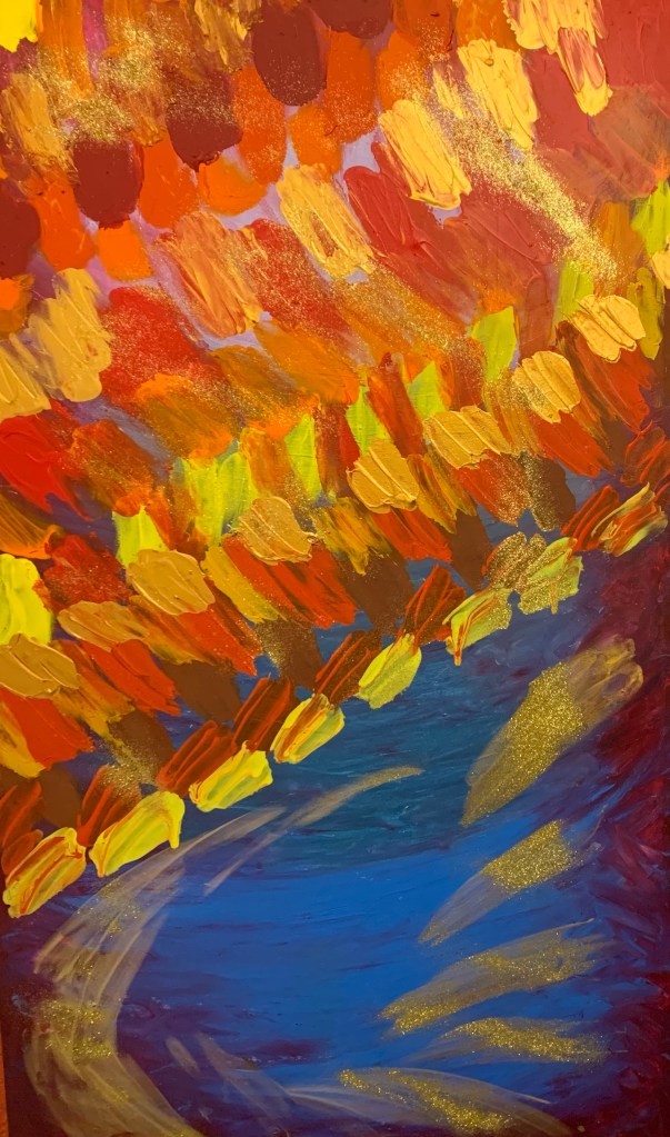
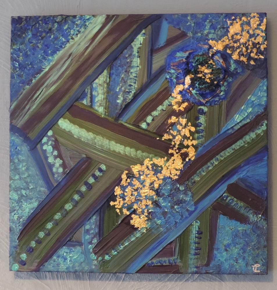
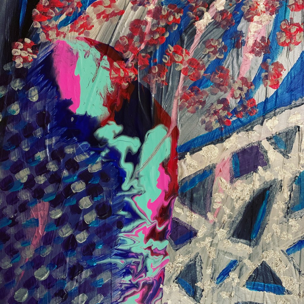
The first coat on this recycled canvas was in a moody grey/white/silver. I sometimes get the urge to create a simple composition with just a couple of colours blended. However, with this one and with all my other paintings so far, I have never felt like a plain aesthetic really “says” anything and could become dull to look at after a short time. So I used the moody style as a starting point rather than a finish line. To me it was the colour of wintery skies. I then added the areas of blue, blue/green and violet. I have continued the same dab marks with the brush on the bottom left section as I’ve done in other artworks which adds energy and in this case it’s dissipating. As the name suggests, the energy is moving quickly to the extent that it skips spring altogether and goes straight to summer. This is evident with the paint poured area that looks like a butterfly wing of bright colours. In the bottom right corner there is a an abstract, geometric, silver shape that to me looks like a pomegranate or similar citrus fruit shape. The top right area hints at cherry blossom which is like a springboard in Spring to Summer. Together the different areas of the canvas create this sensory overload and it takes you on the journey through different scents, moods, scenery, all whilst exploring light, dark and depth. It is a very busy painting that is very striking on the wall.

© Freshwater Shoal (2021), Mixed media on canvas, 20″ x 39.5″/ 51cm x 100cm

This is one of the biggest pieces I’ve done to date and catches the eye of anyone who is in the room with it. The inspiration came from a documentary I watched about different ecosystems and how they have changed over the years depending on what fish gather where. It also came from a memory of watching my Dad fish for mackerel. You could sometimes see the shoal swimming together. I love how the light reflects off their skin in the water.

I wanted to use orange, yellow, red and blue together with flashes of gold. It is a very energising colour combination. The marks I made across the top add energy and flow to the piece, just like the way a shoal of fish moves together in harmony. The layers of blue and green underneath give a sense of depth to the painting and a feeling of being in deep water. The more you look at it, the more you can imagine swimming with the fish and become one with the painting.

© Portal Parameters Of Fear (2020), Mixed media on canvas, 24″ x 24″/ 61cm x 61cm

This is one of my absolute all time faves in the collection. It was an intuitive, free flowing process whereby I just let the paint take me with it. I was in a nervous mental state as I was about to fly to Japan on my first long haul flight. All I could see in my minds eye was the plane swirling in the air and then falling into this portal. I imagined that either I was about to find out what happens when I die or I was about to go through a spiritual rebirth with some newfound courage! Yes,yes…I know, very dramatic – haha! But when left to my own devises, my mind does wander a bit on some weird tangents. Crazy or creative??! Who knows! But this piece reminds me that “I felt the fear and did it anyway” and came out the other side alive! It was such a victory going to Japan! 🥰

I am currently building my website and so you will soon be able to find my available artworks for sale there: http://www.cltabstracts.co.uk

Or you can visit me in Cornish Makers, Truro, which is just off Lemon Quay in Tinners Court.

Or drop me a comment or msg on here or Instagram @CLT_Abstracts and I will be happy to help with any enquiries.

© Glorious Freedom (2021), Mixed media on canvas, 19″ x 19″/ 48cm x 48cm

Moving into a more representational aesthetic, I decided I wanted to be more vocal about the Black Lives Matter movement. As a white, English person, and coming from Cornwall which is at times quite old school, I wasn’t educated on race issues whilst in school. Furthermore, I think there was only one or two people in my school that weren’t white. Yet I grew up idolising many black vocalists. I was obsessed with and still do love gospel choirs and genres like blues and soul. I started singing at a young age and noticed the difference in the vocal qualities of black singers compared to my voice. Not just because I wasn’t accomplished but their tone was always richer. From that discovery, I always felt like black people had a magic that white people like me will never have and I wanted to protect them so they could share that magic with more of the world. I know how naive and silly that sounds and via my Buddhist practice over the last 10 years I have come to realise that every person has magic within them and it doesn’t matter what shade your skin is. Through the race protests, it has been highlighted that being white really has been treated as a privilege for many things and that black or mixed race people have had to fight so much harder to have the same access to things. So as I was painting this piece, I wanted to put myself in the shoes of a black woman and let her be heard. Not only does self expression mean everything to me, but being heard, understood and taken seriously is of utmost importance to me. I believe every person, regardless of specifics, should be given the same chance in life and I’d like to offer a platform to do that.

I am very happy to hear that justice has been achieved today for George Floyd too. Nobody should be killed by the very people who should be protecting society. And definitely not because of their skin tone.

© A Family Of Hearts (2021), Mixed media on canvas, 12″x 12″/ 30cm x 30cm

This piece is comprised of layers of texture, stencil prints and shimmer. It was born from a vision i had that I would meet the love of my life and we would have two biological children and adopt another. I can’t say this has come to fruition yet but it’s still very much a dream I’d like to make a reality. At age 35 nearly, the social expectations are not being met and in the midst of a pandemic I am on a very dusty shelf. In 2021, I feel like I’m embarking on a journey of letting go and renewal. So it’s not to say my dreams won’t become real. They may just happen a little later than planned and in new circumstances. AND THAT’S OK! 😉

© Sea Treasure (2021), Mixed media on canvas, 16″ x 16″/ 41cm x 41cm

Again, this one uses lots of texture and has a sculpted aspect to it with the island design being 3D. I wanted to incorporate sea green into this, alongside the coastal blues, to give the idea of deep water. The gold leaf represents the things buried in the depths of the water. There really is a whole other world there that most of us may never encounter.

The island idea stemmed from the global social issue of loneliness. It has now been recognised as a reason for deterioration and illness in people. It’s like a pandemic within a pandemic. From my experience as a carer in previous years, I have seen first-hand how much older people suffer and can sometimes only see their carer the whole day or week as their family members are busy living their hectic lives. Likewise, younger generations with underlying health conditions, like myself, may become isolated too due to not being able to mix with others as they have a lack of energy or weak immune systems. Some people also struggle with keeping up with social commitments when their mental health gets in the way too.

Something you’ll learn about me as we go along is that I love to help people and stand up for social issues that need more focus. Please, if you take one thing away from this blog, check in on your friends and family. Especially the ones you think are always seeming strong and unphased by life. They’re the ones fighting the hardest to see another day. Be kind. Buy your Grandparents flowers and ice cream or give them a call. 💐 They’ll always be grateful 💖🌈💕

© Dandelion Dreams During Lent – Part 1 (2021) Mixed media on canvas, 12″ x 12″/ 30cm x 30cm

This started with two things in mind; the colour violet representing Lent according to an article I read and also the fact I wanted to create a set of two that could sit side by side, perhaps in a holiday home. I was swept up in the Easter holiday vibes despite lockdown still holding everything back. Cornwall thrives off visitors. The visitors give the county its energy that takes it from season to season. Without that norm, everything gets a bit lost and quiet. I’ve missed that flux.

So, I started this and another at the same time with the same colours and layout. I decided to use stencils for a more intricate design that would work as a print perhaps on letter writing stationery. It reminded me of some I had in a drawer from many years ago when I used to write to my best friend who sadly lost her battle with Leukaemia. So I guess this set transports me to times spent with her in a holiday apartment in Carbis Bay, near St Ives.

© Dandelion Dreams During Lent – Part 2 (2021), Mixed media on canvas, 12″ x 12″/ 30cm x 30cm

Themes that come to mind with this set are: transactions between people and places, bright holiday homes, sunny days, Easter, intricate mark-making and combining violet/blue/gold/silver.

© Opal Fields (2021), Mixed media on canvas, 18″x 14″/ 46cm x 36cm

For this, I really enjoyed blending and layering colours and creating sections. This reminded me of both the iridescent colours of opals and the changing appearance of fields through the summer. I decided the ombré blending didn’t need any distracting elements added to it so I just added texture to the gold areas. For this, I used lino clippings embedded into texture paste as I don’t like to waste things and I feel the Lino gives a quirky appearance. The gold leaf adds depth and light to the textured surface again adding to that gem like or sunshine quality.

© Manic Endings (2020), Mixed media on canvas, 20″ x 20″/ 51cm x 51cm

This one came about through conversations with a friend through the dark times in lockdown. We both wanted it to come to an end and to find out what was on the other side. I knew I wanted to work with a vivid combination of blue and pink, as they are my go-to happy colours. The mark I made with the pink reflected back at me as some kind of symbol similar to a rune perhaps. This shape and rune idea has continued through other pieces. It is a natural mark I seem to make when in an energetic state whilst painting. It creates a pleasing flow when looking at the whole aesthetic. The delicate nature of the gold leaf adds light but also tells the story of how mental health can fluctuate with light and dark moments leaving us feeling fragile. I’ve also added some interference effect paint around the corners which make the piece shine and alter with the light.

©️Seafoam Rush (2021), Mixed media on canvas, 16″x 20″ / 41cm x 51cm

I created this piece with the flow of waves in mind and I envisioned the tide coming in with a frothy shoreline. I wanted to create a painting with more a masculine composition. The reclaimed canvas with the seascape colours and energy emanate the pressure to act against climate change. I have used silver leaf to complement the white and silver acrylic in a bid to give an almost 3D seafoam-like appearance.

You can buy this piece in Cornish Makers, Truro, Cornwall. This creative collective is a permanent shop showcasing many Cornish artists’ work. We’re just off Lemon Quay in Tinner’s Court. Feel free to come in for a browse!

Design a site like this with WordPress.com
Get started