©️ Island Hue (2020), Mixed media on canvas, 10″ x 24.5″ / 25cm x 62cm

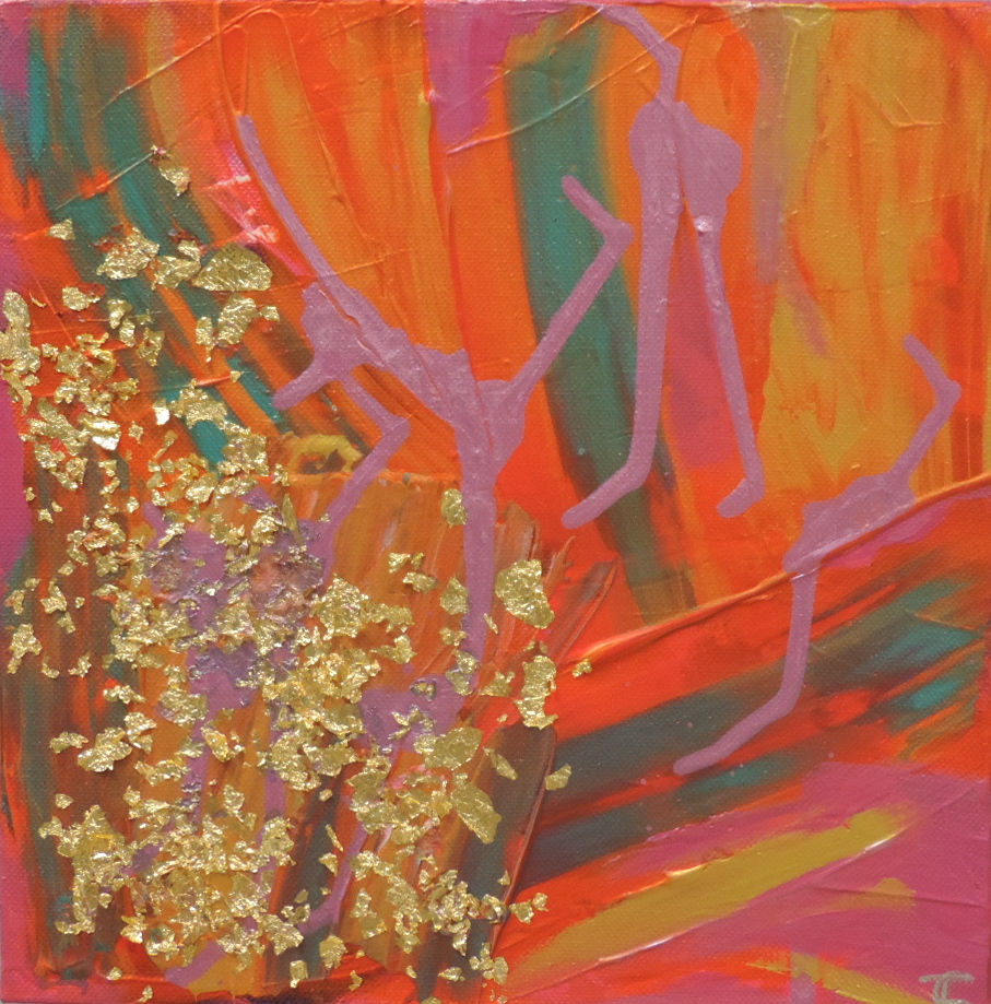
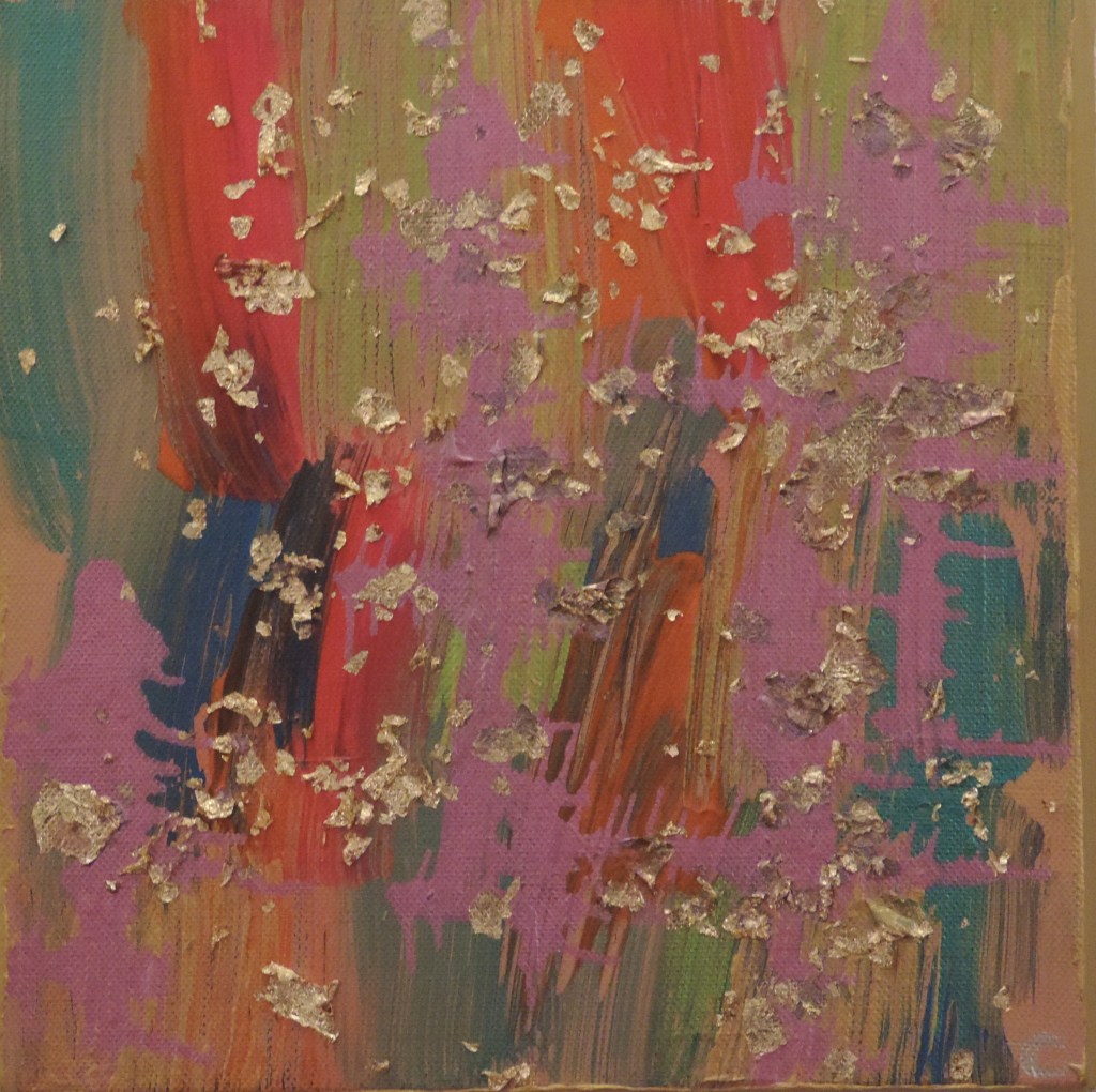
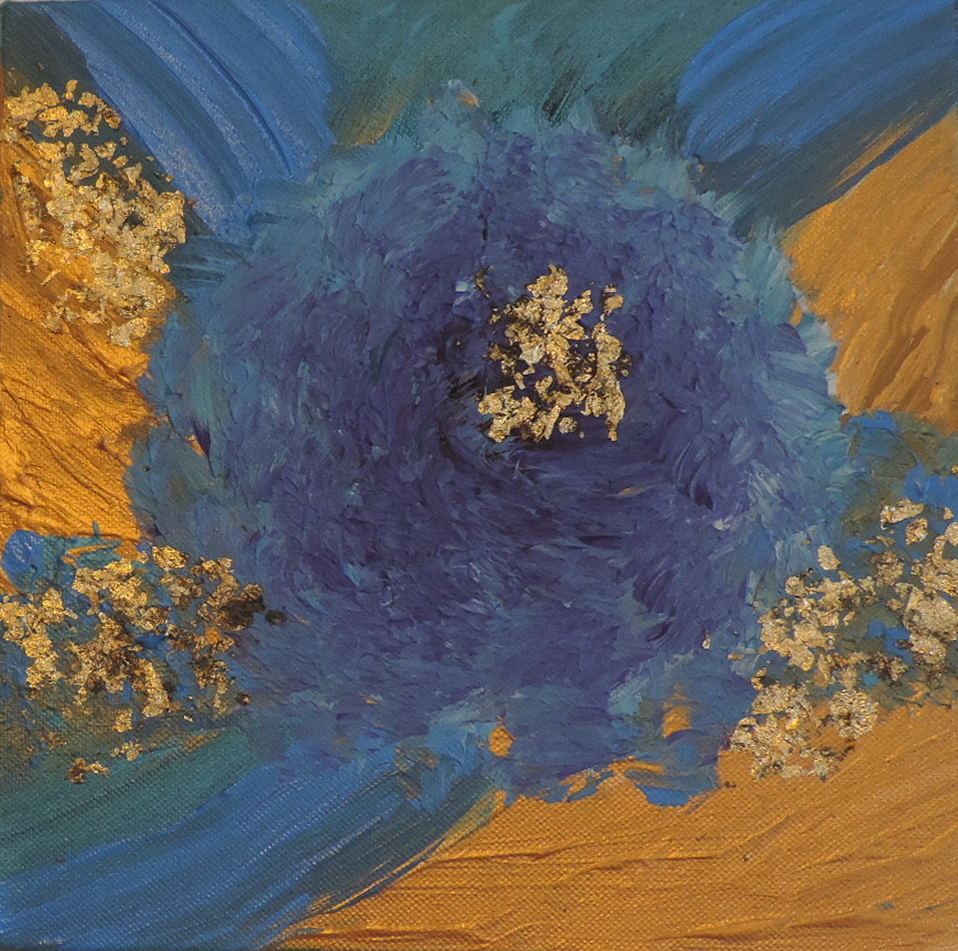
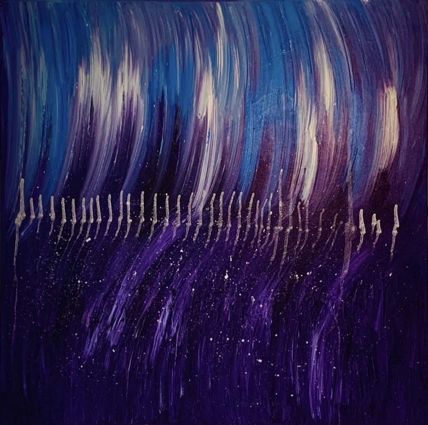
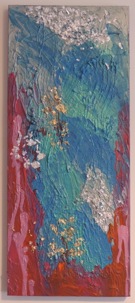
I tend to reuse canvases to help the planet. When i first got this one it was second hand but then i created a fishtail fashion design on it with texture paste and various mark making, then it changed again and was a design made using an actual fresh lily which i used to spray paint around. The stencil/resist process i was trying to achieve didn’t quite work but i was left with a curious effect that looked like a bruise. It was weirdly not as depressing as it sounds! But after a few years of not knowing what to do next with it, i decided to create something brighter inspired by the Cornish coast. I have to say i really love the thickness of the paint and layered textures in this. Plus, the colours work really well together to create depth and a sense of luxury. This is the first piece i have created using both silver and gold leaf on the same canvas. If paintings were edible, this one would be rich and so morish!

©️Golden Tropics (2020), Mixed media on canvas, 10″x 10″ / 25cm x 25cm

Whilst sitting more comfortably with the colour orange, and still in a holiday daydream craving heat, i created this beauty. It warms up any space and has a new energy despite the repetitive island theme. Although my work is never created in a deliberate representational way, the pink ink drops reminded me of flamingos drinking at the edge of the shoreline. Now where’s my sunnies and palm tree shirt?

©️Tropical Hues (2020), Mixed Media on canvas, 10″x 10″ / 25cm x 25cm

This piece contains a real mish-mash of colours with gold accents, in a bid to push my collection into a brighter direction using orange and green, as well as the usual blues and pinks. When close up you can see lots of layers and experimental marks. From a distance, it can give a sitting room, for example, a light and airy feel. I found that it allowed my cottage to take on a more modern aethetic. It works really well with plain white walls and neutral curtains. The gold leaf accents encourage the light feeling to bounce around the room. For a small piece, this has an unusual grande impact. It has become another favourite because of how versatile it is with home decor themes and spaces.

©️Tropical Trance In Lockdown (2020), Mixed Media On Canvas, 10″x 10″/ 25cm x 25cm

This one was created in lockdown 2020 whilst wishing i could travel to a hot country and sit on a tropical island sipping cocktails and feeling the heat of the sun seep into my bones. I really miss that warmth and freedom! But don’t we all! The theme of freedom and travel went through to a lot of my other pieces too. As a Cornish artist, i am used to living fairly near the beach and catching some rays in the midst of Summer but when you’re confined to your home or local streets, it is difficult to get that beach fix. It’s so close, yet so far and the frustration of that stuck feeling just burst out of me into this piece. The vibrant contrast of the blue against the gold really helped me get that holiday craving satisfied a little. If you’re going to have to sit and look at the same four walls, it definitely helps to have some colour on them that whisks you away to some place else! I think the idea that lots of water was meeting in one central swirlpool reflected the desperation i felt at the time i painted this. The gold leaf was added as a dimension of light, fantasy in terms of island treasure and also to add a dimension of heat. The kind that makes you glow and burn all at once.

©️Transient ebbs & flows (2020), Mixed media on canvas, 30” x 30”/76cm x 76cm/

This piece is my favourite and one of the first that i created. It started on a day during lockdown 2020 when life was heavy and i wanted to send it in a new direction. I also knew i wanted to work on a bigger piece and just let loose with it. It started a spiritual, intuitive and therapeutic process where i would just let go of everything and let the paint take me anywhere it wanted to go. This process continued in all my creations after this. This piece became very energetic which was the opposite of how i felt, as i have several health conditions sapping energy out of me. I find the colours whip me up and help me along every time i look at it. It reminds me of being inside a wave and going with the flow of nature. The marks across the centre were made with ink and i just kept moving the canvas until i felt like it was complete with the right drip marks. They have created a pulse/ECG line like you’d find on a heart monitor but also it could be viewed as fish bones which again took me back to the wave idea. I found this interesting because it seemed like the art was trying to breathe new life into me or whoever looked at it. It really does take the viewer on a journey to a better place. Due to it’s size and shape, the artwork fills a big portion of the wall and can become meditative if displayed in a bedroom or quieter space. When i look at it, i feel completely absorbed by it, much like the experience i had when in a room of Rothko’s at Tate, London, except i felt more hopeful rather than in a low mood. I adore Rothko’s work though because of that feeling of being one with the work. He also worked on bigger pieces and loved to use colours to evoke feelings.

Design a site like this with WordPress.com
Get started